CTM (Create the Meeting)
ZericaRibica | Thu, 08/09/2018 - 17:58
Brief from client
The wanted a refreshed / simplified version of the old logo. Something less serious and more playful.
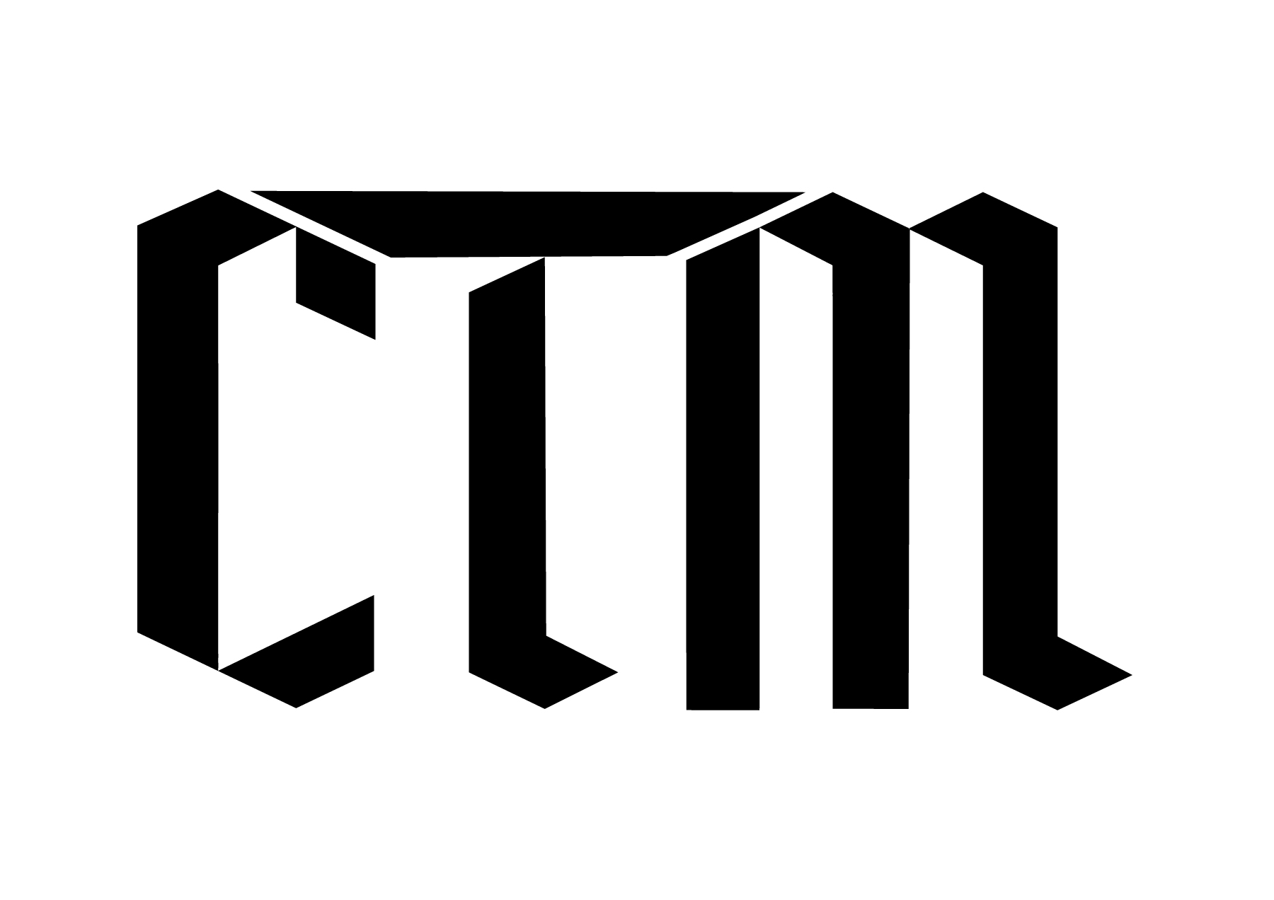
A newer, fresher and more simple/geometric version of the old logo.
The lettering on the old logo was supposed to be reminiscent of 1940s
german gothic/fraktur lettering. The show was based on subtitle parodying The 2004 movie Downfall. The second season will not be a subtitle parody but an animated series including singing and original comedy sketches, much different from the dark and offensive humor of the first series. My job was to simplify the logo and give it a new but still familiar look. You can see the old logo here: https://imgur.com/3QAdrXa
3 Comments
I think it is a step in the right direction, but what if you went even farther? Maybe a very different, more modern approach with some sort of subtle hint to the old logo?
I think the way the T connects to the C and M is what is bothering me the most.
I 100% agree with you. The T looks very awkward. But they don't want something too abstract. Is there any other good looking way to connect these two letters?
What if they didn't connect?