Curartor
wouterdeboeck | Wed, 01/13/2016 - 11:57
Brief from client
simple wordmark, no symbol, no attention to extra 'r'
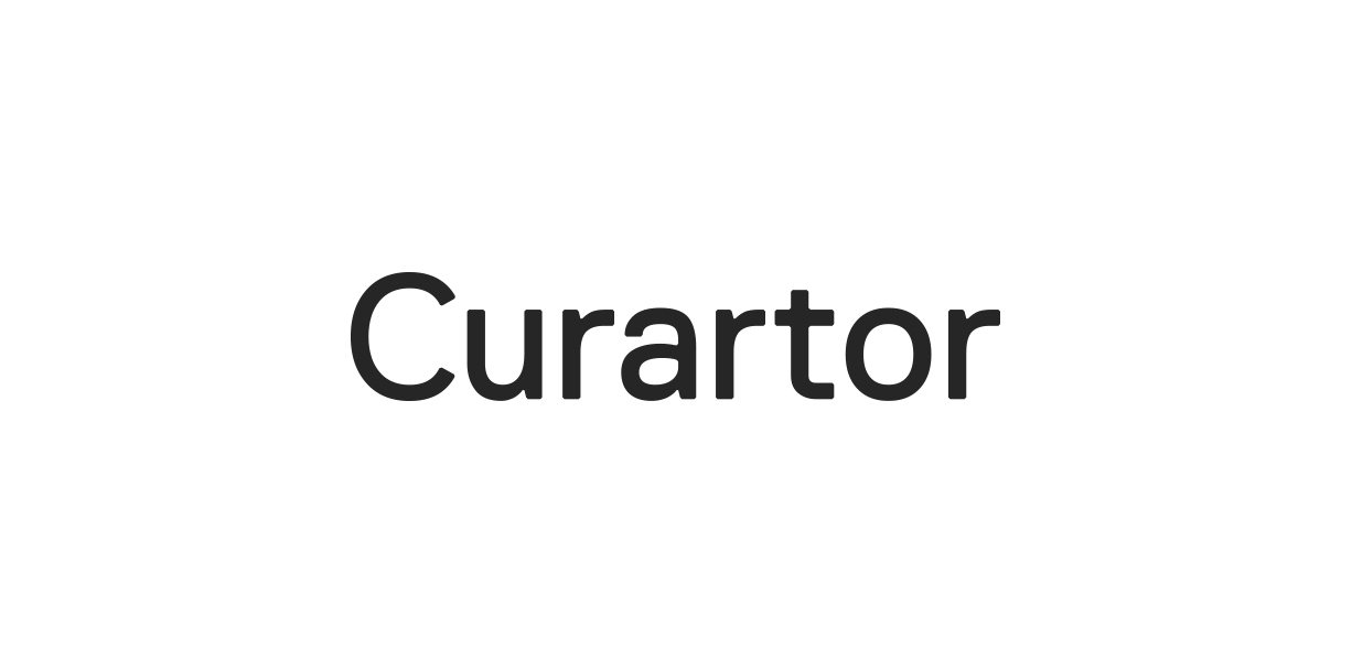
I need help with kerning this wordmark, something is off, but I can't put my finger on it.
simple wordmark, no symbol, no attention to extra 'r'
I need help with kerning this wordmark, something is off, but I can't put my finger on it.

 Partnered with Clios.com | Ads of the World
Terms of Use | Privacy Policy | Cookie Policy
© 2021 Clio Awards LLC.
Partnered with Clios.com | Ads of the World
Terms of Use | Privacy Policy | Cookie Policy
© 2021 Clio Awards LLC.
3 Comments
The C/U are too close together, as well as the R/T.
Why that font?
Thanks Killswitch, one of the reasons I chose this font was because of how te terminal of the 'r' connected to the crossbar of the 't'. Usually one is higher than the other. Wouldn't adding more space between the R and the T make for a really big gap of whitespace between them?
I'd experiment with it.
The R/A combo is a bit tight as well.