Dança Interligados
philaros | Tue, 01/03/2012 - 02:55
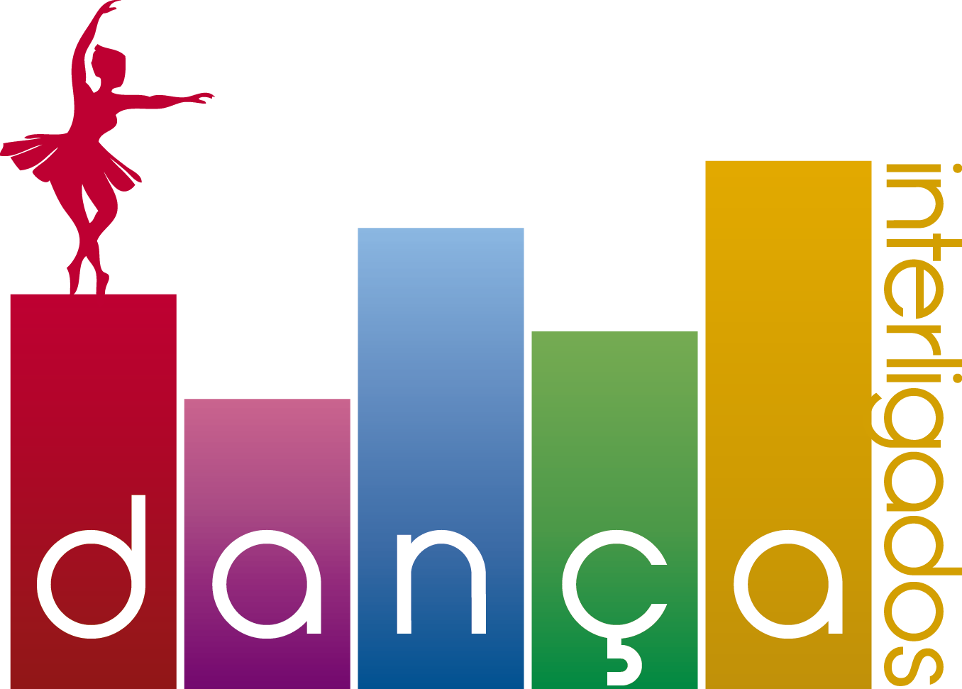
Brief from client
It is a dance group formed by young evangelicals, composed entirely of girls that focus on the practice of Ballet.
The group performs with the band during the meetings of the church.
Interligados is the name of the group of teenagers.
9 Comments
i think you need to simplify....for me this type of design doesn't work...
Agreed simplify, try using the ballerina
Bad weight, no shape, too many colors.
Start over
i know how it feels that the idea of a dramatic symbol with the whole concept,..your idea is good for me but...i think this is better if you do Poster.
make another,its almost..back to your drawing board..
You can just use the red color highlight and the ballerina the others are not necessary.
Everything is out of proportion and the tiniest thing there is the name of the company.
Ballerina clipart is a joke and and those gradient rectangles do not make any sense.
Now, how about you sit down with a nice book on graphic and logo design, read it and then think about what you did here.
Who knows, maybe you will be laughing as I do when I see this.
to much going on...need to make more simple.
It's nice and colorful, I think I like the idea of the bars. But the dancer is a cliche, if you are making a modern logo keep it simple.
lo puedes mejorar!