David Hunter
Gregorr | Tue, 04/16/2019 - 21:44
Brief from client
Hey Guys
Just looking for a bit of feedback/thoughts on this.
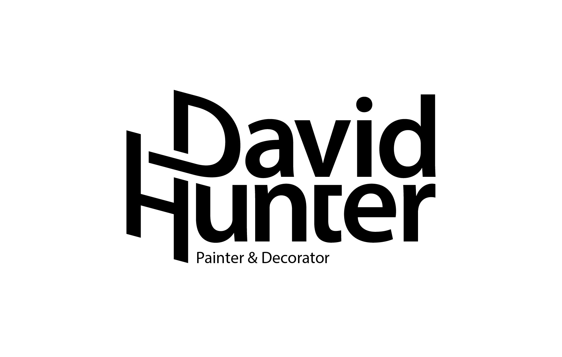
Client is obviously a paintrer/decorator.
Thought behind this logo was to try make the H represent a ladder...
I feel like it may be a bit dated, but I'm an old bugger so I still like it.
Thanks
3 Comments
Distorting type is always very dangerous and should only be done in extreme cases. It almost never looks good.
I on the other hand thinks it looks kinda allright. I disagree with Iraszl. There are no strict rules regarding to extreme cases. You can't state that it almost never looks good. There are a lot of distorted logo's that actually look very nice. In terms of making it look like a ladder you kinda missed the nail. Try to sketch some more and you will come back strong.
Thanks for the feedback guys, all points taken on board. Will upload future changes.