Dean and Brown Catering
npentz | Mon, 08/20/2012 - 18:23
Brief from client
Catering for weddings events and corporate gatherings. Looking for brides as clients. Offers fully customizable menus
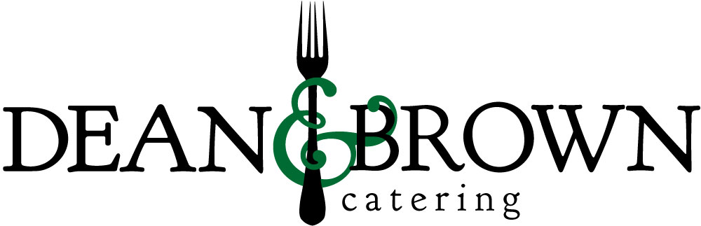
Used a serif font with a decorative and symbol. I feel that this presents a classic and elegant look, qualities that many brides are looking for. It has more formal look that will convey quality. I chose green for the ampersand because it provided a nice contrast to the black lettering. I also felt that dark green would suggest a freshness for food and still look elegant.
The colors of the ampersand can be changed as part of the identity, to play to the customizable services I would change the color on each page of your website for different subjects, to match event colors, or changes in season.
3 Comments
Yes, this could work, I like the idea, but you could bring some dynamic to the entire logo, after all it is made for wedding therefor it must be playful and cheerful. Something like this:
I like this! (I actually like it the way you have it better than the way dionisdei has it.) But I think you should steer away from that dark green color.
I like how you have the ampersand almost wrapping around the fork and the B like a vine, but a part of that detail is lost because the green is so dark.
I know that you said you could change up the colors depending on who you're working with, the season, etc- but I guess I'd just not do such a dark color. Or maybe try keeping the fork black but making DEAN and BROWN a dark gray?? Either way, I'd just play around with fun colors! It's a nice and simple logo - maybe not earth shattering in uniqueness, but that's not to say that it doesn't work!
I also really like this (your version better than the other one posted), its elegant and simple but still a strong identity with the ampersand and the way it wraps. I agree with saraqroxy the colour isn't my favourite, maybe a gold or something to keep with your concept of classic and wedding.