Decor Store
j.o.y | Thu, 03/15/2018 - 18:39
Brief from client
Clean, somewhat feminine, modern rustic
Target mostly adult females
Business sells "modern farmhouse" style, new and some up cycled home decor and gifts.
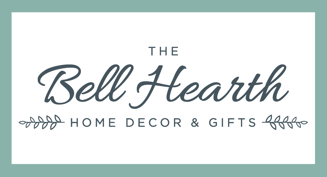
I'm going with a soft color palette, I modified a pretty script font and paired it with a clean san serif to keep the modern feel.
9 Comments
Full logo set- also white on color backgrounds.
Much debate about the monogram- would love some opinions on this too!
Clean: check.
Somewhat feminine: check
Modern rustic: check
This logo is working really well. These two fonts work really well together.
Regarding the monograms just above, I much prefer the one on the left. I'm rarely a fan of script fonts for initials or worst of all, acronyms.
Maybe, but this is a just a detail, try to have the branches as think as the secondary font.
Really cool job overall.
Fantastic! My vote is for the left monogram hands down.
Regarding the monograms, I agree with the script comment above, but I really like the enclosing box on the right. I don't know if it would work to move the San Serif BH to the box on the right or not, but it might be worth a look see.
Thanks everyone- I fought for the san serif monogram pretty hard, but she loves the font I chose and is pretty set on the script version.
It is after all just a "little something extra" and isn't her actual logo- so I am fine with it . . . . .just as long as no one thinks its a major fail and destructive to the overall set, anyway!
I've gotta be the only one who likes the script monogram.
To me, the serif one is a bit of a disconnect from your logo, and it looks like it would exist on a coffee shop, where the script monogram looks like it would exist for an inn.
It would have been nice if the script letters had been used for the monogram format on the left. Just my two cents.
Either way, good job, I've literally never seen Joy's work.
I like to remain a bit mysterious lol
Thanks!
i prefer the script monogram style as well. super dope concept.