Brands of the World is the largest free library of downloadable vector logos, and a logo critique community. Search and download vector logos in AI, EPS, PDF, SVG, and CDR formats. If you have a logo that is not yet present in the library, we urge you to upload it. Thank you for your participation.
Version history
Version 1

- I
- S
- T
- C No votes yet.


2 Comments
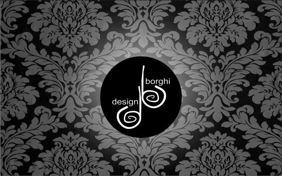
Generally, you've got a good idea with the sketchy spirals forming the letters 'd' and 'b'. However, I think there are a few problems.
The vertical lines should lead into the flow of the spirals. In other words, flip the spirals horizontally so that the vertical lines descend and connect to the ends of the spirals (see below for a rough idea).
Also, instead of simply duplicating the spirals and flipping them horizontally, make them different from each other slightly. That will give things a more customized hand-drawn look.
I think the text looks slapped on without much thought. Work on placement and font selection, try out a few more ideas and see what you can come up with.
Not sure about the background. It's clearly clip art, and really doesn't belong here. Your logo should speak for itself without needing a fancy pattern to make it seem more interesting.
Keep trying! You have the start of a good logo here...
I agree with Unterm, though I like how the symbol looks. But the words "design" and "borghi" are randomly placed. And the get rid of that background. It looks really amateurish.
Also, when you present your work here, please do so in English, so everybody can understand (we are from all over the world!)
Keep working on it and have fun!