Designsapient.com
snmbala | Thu, 08/13/2015 - 09:32
Brief from client
Logo for a designer group work as a team and share the profit.
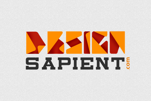
We are creative guys who use original concept by doing lot of paper works. I have used origami concept to symbolizing our paper work.
9 Comments
I can't read the top one at all. The color choice is too industrial. It says factory to me not design. Again second font is industrial and not working.
Gradient is never good thing for a paper.
So Bariqo What color combination would you prefer for this logo? or you mean the whole concept need a workaround?
i just can't read the top text
I really want to like this design. I think if we clear up readability, we'll be getting close.
Careful with gradients/shadows. Be sure that it translates well to flat black/white as an alternative. Every logo should.
Watch your kerning, too. There's extra space between the S/A.
Yea, maybe try and take the gradient away, I understand it is there for shadow purposes and I do think it looks really neat, but it doesn't fit the current trending style. Try an work the whole logo in one color then worry about the colors. You already have heard the issue with the font, so there is not need to get into that...
I could read it fine btw, I like how abstract it is.
Good job!
I'm with Bariqo on this one. "Design" is hardly readable. The origami idea isn't really bad per se, but in this instance it just doesn't work. If it take squinting eyes to read the word mark, the logo isn't working.
I do like the font for "sapient" and the color combination though. I can definitely sense some design skills behind this logo, but you need to greatly improve the legibility and generally keep things simple.
Keep it up!
Can't read "Design" need to be simple
I did not understand the above text, I could only read in the file description.
The colors seem nice, I think you have to keep working on this.
Interesting concept but the implementation feels forced.
For example, the lower fold on the E is subtractive (it's easy to miss that the fold defines the bars -- both arm and leg). My test is always to look at the silhouettes...in this case the E, G and N would fail that test.
Gradients I avoid at all costs. They have very limited usefulness in logo design in my humble opinion.
I'd continue exploring alternatives...if you can find a way to incorporate origami great...but don't force it.