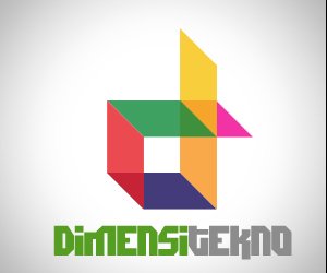
DimensiTekno
Brief from client
This logo contain two letter in one shape. "d" and "t" letter. i have 4 version and dont know which better or best. please help me

We are web developer from Padang, Indonesia. We can do our project with best of our efforts. We are team of graphics designer and web developers. We do web design, developments, animations. See our website at www.dimensitekno.com. If You like our works, lets talk about further details. We work with competitive rates. We are very interested in Your project.we are looking forward to hearing from You. We are expertise in PHP and mySQL development. we have developed very good sites in php and mySQL. We have 7 years of experience with Drupal,Oscommerce,PHPbb,Joomla,Wordpress,Mambo,Zencart. Our developer and designer team can create a custom solution for you.


11 Comments
version 2
I prefer this one.
About the color filled version, i love the "D". I think this could make the brand to stand out from others.
Even the current typography is better than the first one and more readable, i dont' feel it as the better one. It looks tasteless and dull against this nice symbol.
About green/gray colors, well i suggest you try to think in other colors if possible, right now around here is another logo with the same color scheme and despite seen what is all about, i'm almost sure it goes in your way (technology). Even myself, I have designed a logo for the same purposes taking in first instance the same colors.
The current symbol embodies the "Dimensi" subject, although it seems to work better for architects or the construction sector, but this is a minor issue.
version 3
I love love LOVE the colors on the main logo up at the top- but the typography here (on the one with the green/gray 'd' above) is tits on toast. (ie- GOOD!)
Could you have this typography with the more colorful symbol from the logo at the top of the page?
I like the font in the second version. It's clear and simple. I prefer the more colorful version too.
I like version 2 maybe you can clean up the font on version 1 and have a colorful version as well as a monotone version
ic ic i detect the problem with my logo is font. oke i will use version 1 and change font. in black white media i will use vetsion 2. any comment? btw thanks all
Use the font of version 2; this is also the one i like best. The colors in V1 are also ok, but I dont like that cut-off font u used in V1.
oke ic now. thanks. i will upload soon v1 with chaged font
ok one more thng. anybody have font suggestions suit with colourful logo?
The best logo is that the client would pay for. Try using a type like in v2. The sign looks brilliant.