Brands of the World is the largest free library of downloadable vector logos, and a logo critique community. Search and download vector logos in AI, EPS, PDF, SVG, and CDR formats. If you have a logo that is not yet present in the library, we urge you to upload it. Thank you for your participation.
Version history
Version 1

- I
- S
- T
- C


8 Comments
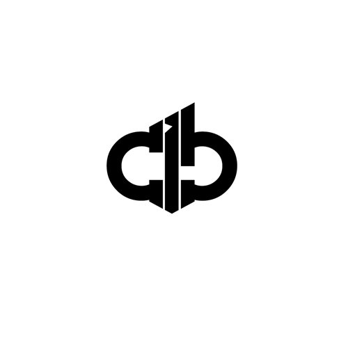
Unsure of an overall idea/concept, although I am unfamiliar with the client. I see a cohesive, well balanced mark. The strong angle's contrast the curves nicely. Any colors? Maybe a two-color treatment. The left and right elements one color and the center piece a different one?
Yes, the first proposal was: CB - black, I - red, but client liked this version. thanks for comments. ;)
This is an interesting brand. It may be hard to understand, but it does require a second look. Perhaps some text to help explain would be nice.
thanks for the tips, i think about it
good work but hard to understand....but good work.
good work but hard to understand....but good work.
Those who don't know it's dj CIB, will deffinitivly never figure out. However, if the guy starts using it, the fans will read it after a while. I think it fits to that young, dj feeling category.
I'd try to make a bit larger space between the letters so you don't have problems printing the logo in a small size.
thanks for the professional advice