Brands of the World is the largest free library of downloadable vector logos, and a logo critique community. Search and download vector logos in AI, EPS, PDF, SVG, and CDR formats. If you have a logo that is not yet present in the library, we urge you to upload it. Thank you for your participation.
D'LUIT POULTRY
exodusstudio | Tue, 06/17/2014 - 17:37
Brief from client
Luit is the location name for the poultry company. My Client asks to create a new logo that can be use locally and internationally.
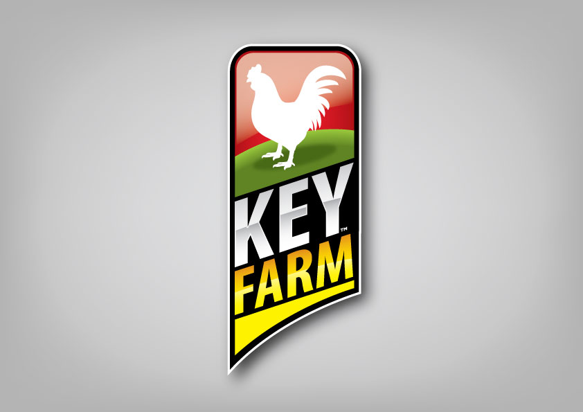
The metallic looking gradients and sloped text make me think too much of motorsports. There is a lot of implied movement. Perhaps these are race chickens? ;-) I also think the glare at the top should go. It's making it harder to see the chicken by reducing your contrast.
I also like the overall as well but I think the gradients should go. You'll need a simple 1-2 color version anyway. Best of luck to you.
3 Comments
I still like the overall design, but I don't see it for a poultry thing.
The word mark makes me think of Duracell, for some reason.
The metallic looking gradients and sloped text make me think too much of motorsports. There is a lot of implied movement. Perhaps these are race chickens? ;-) I also think the glare at the top should go. It's making it harder to see the chicken by reducing your contrast.
I also like the overall as well but I think the gradients should go. You'll need a simple 1-2 color version anyway. Best of luck to you.
GREAT JOB!