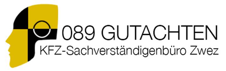
Dummy Head
089 Gutachten K... | Tue, 02/13/2018 - 12:43
Brief from client
What do you think. Good or Not?
I´m not quiet sure if this is to long or if they can actually work with it. It looks great on an header.
Client: 089 Gutachten Kfz-Sachverständigenbüro Zwez München
12 Comments
Since I am not able to read German, if this is a logo for crash test dummies, then I think you nailed it on the head, so to speak. A little information about what you're trying to say with this logo would be helpful.
The name of the company means in Englisch somthing like: 089 report automotiv expert. They are writing reports after car crashes for ther clients, so they can get money from the insurance companies. They only earn money out of car crashes. This was the reason I created this crash test dummy for ther logo.
This would look a lot better if the two lines of text were aligned. Also, experiment with different font weights. Having both lines the same looks unappealing here.
Going with a simple flat style mark is nice. Could it be further simplified?
The client want´s his hole name in his logo and this text is his hole name. If I make his name smaler nobody would be able to read his name.
Thank you for your response.
This is definitely not a good logo. To be frank, this is a mess. Is this really the name of the business? It is way too long; I know it's German but damn, this will never sit right in a logo. I suppose that "KFZ..." is just the subtext. I always advise to not have the subtext being an integral part of a logo, especially if it's that long. It just complicates everything.
And what's up with the font? It's looking super weird, on top of being super dull and plain. The characters are totally non consistent, with different x-heights.
Thank you for your response. Yes it´s german and the client want´s his hole name in his Logo. This is no subtext this is name of his company. So he want´s his hole name in his Logo. The font is typical german ;).
How would you solve this in your way?
There is no way to eliminate words from his name if this is the complete title in German. The German language is known for having extremely long words and descriptive sentences. Some words are so long and compound they basically are sentences. I wouldn't mess with his name. Just play with the type - maybe as JNF Design had said and try to align. Or toy with fonts and leave it under the head.
Just for fun here is a word / term
Rindfleischetikettierungsüberwac-
hungsaufgabenübertragungsgesetz --- I put a dash in appx the center,
it doesn't exist in the real word.
(63 letters)
it means:
"the law for the delegation of monitoring beef labeling."
I'm not really understanding how the language being German somehow gives the letters different x-heights. The only way I can see that happening is if you forced a font that doesn't have the available glyphs to represent the german language.
My advice would be to find a font that has a full glyph library, so you can use the German language effectively.
You are correct. German or not - should not effect x-height of font and does
not. I thinks it's just the font.
Another long one for fun! 4 words in one!
Donaudampfschiffahrtsgesellschaftskapitän
=
"Danube steamship company captain"
I happen to like the head/dummy and think it is spot on for a German company that is
likely very precise in what they do. So I think you are on the right track. But you
have some work to do on the type to tie it all together.
Unfortunately, you are burdened and bogged down with a super long name,
but there is nothing you can do if that's what he wants.
My best suggestion on the typography would be to go back to the old school
basics of Swiss and German typefaces, find something classic and I mean
before Helvetica - Like Aksidenz-Grotesk, (Futura might work here)
- Find something with a ton of weights and due to the length you will be able
to fit them in the same width and maintain legibility if you go that route.
Then you might think about some simple line work if you want to extend a bit under the
head/dummy.
This could be good or really bad. But I will throw it out there anyway.
What if you were to fill in the bottom right of the head black and then Toy with adding KFZ on top in white or yellow. Just a quick idea. Then you would also have a separate icon with the Dummy head and just KFZ which I am guessing is a somewhat important part of the text.
Thank you Carlo for your responses and the new ideas. Thes are some tricky German words you wrote ther. Thankfully I don´t have to use this in the logo ;). I think I have to chosse a new font like most of the people are telling me. I don´t think that I´m going to play arround with the head but thank´s for this suggestion.