Duncanville Parkour
Jorge_Design | Thu, 08/09/2012 - 22:45
Brief from client
they are a few kids starting to make a name for themselves in the Parkour world...
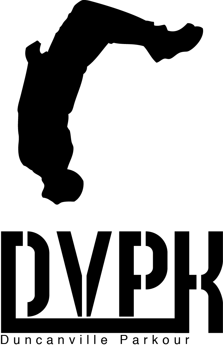
they wanted something easy with one color... i took a picture of one of them doing a back flip turn it into a silhouette and added the text fix it a little more...
10 Comments
The illustration is okay but I don't think it really works as a logo. The text isn't prominent enough for it to function well. I would try making the figure the same height as the lower portion and maybe placing it on the left. The DVPK mark is interesting but I would keep working on it and see if it can be tied in more somehow. For the Duncanville Parkour text I would try a taller, more condensed font to increase the size while keeping the alignment. It's way to small now and looks more like a tagline than the actual name.
That would probably work better without the upside-down chap and the Helvetica subtitle.
I disagree with previous speakers, must say I like it. However, keep in mind that it will be a bit of a challenge to use it for some applications (high logos always are).
I actually like that the dude (although you could fine tune him, edges looks a little quick and dirty) is on top of the type, cause I think it catches one of the many essences of parkour - height.
Think you could go a bit wild with the font for DVPK. Parkour is a street movement - and I think that could be communicated better with the choice of font (I'm thinking graffiti, sort of sprayed stencil style....) Once you have the DVPK settled, it would probably be quite easy to find a better suited font for Duncanville Parkour.
Think your close, but a bit of fine-adjustment could turn it into something cool ;)
I don't mind the graphic all that much, I just think it could be better applied to this logo. I'm not a huge fan of what I threw together here, but it gets the idea across: (but it's completely possible that everybody will detest it!!)
pretty good, i like your idea. But i am afraid the guy looks like is gonna suffer in the next moment...anyway the idea is a very fine one...
the symbol is the only bit i like, i definitely think you need to work on the fonts, i really dont like the black bar joining the D and K and i would suggest that when you chose a better font that you dont join those 2 letters together. im into portrait logos at the mo so i like the overall shape of your logo, you could maybe think about putting the whole logo into a portrait box with the symbol coming out of the top like the idea ive uploaded for you. This is just a suggestion, and something i did really quickly just to give you another idea, the border may not be necessary or you could make it into some sort of background like a building
Oh, I like that!
thanks :)
yer idea is fine , i like the fonts and how you solved the verticality problem...good job here.
pretty unreadable at the first look, get rid of the stencil font or exchange it with something clear and sharp, personally i would go in the manner M@ did. Glaser stencil would be a solution if you want to keep a stencil font, and sara's idea is a good start to get to the finish. If you got a better position of the dude you can try something more balanced, but this is fine too. Good luck there.