Brands of the World is the largest free library of downloadable vector logos, and a logo critique community. Search and download vector logos in AI, EPS, PDF, SVG, and CDR formats. If you have a logo that is not yet present in the library, we urge you to upload it. Thank you for your participation.
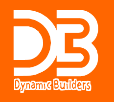
How can you make a spelling mistake in your logo!!?? The Angle on the bottom left makes me puzzle... maybe draw the left upright section longer up to the "D" top edge.
Ah the spelling mistake! Happens to the best of us!
I don't think this is the right logo for a construction company.
The colors are too soft as well, the logo tells me they like to build windows?
The Fonts need tweaking the Dynamic is to skinny and Builders is too plain.
Construction Logos want to be as strong as the structures they build!
This is a construction company right?
I would go with the whole name as DB on it's own stands for Deutsche Bundesbahn, the German railways.....and go for something dynamic, like in the name!
ok, the idea is not bad but is badly used. I like the angle of the logo but those squares ruins it so you should find another way to integrate or get rid of them. You can use some elements of descriptive geometry in this and it fits well with the profile of the company. Get rid of the arrows. Font in "DB" here have a potential so don't hurry to change it, the other font must be readable in both small and big prints. Colors are not especially bad but you can use something stronger. good luck with that.
1. Idea of letters as floor plans is good, but poorly executed. 2. The kerning is terrible. 3. The font choice is questionable. 4. The arrows must go away (agree with hueroth) 5. The logo should be attractive and it is not the case here. I think that you should look some examples of good logos on this site or on logoed.com and to draw your inspiration from those. Do not lose hearts.
This one should probably go back to the drawing board/brainstorm. The colors are not "builder" or "developer" colors (I cannot imagine the construction team pulling up to my home in a lavender van and feeling like I had called the right place). The graphic as a whole lacks sensitivity to design and spacing and does not hit the mark on 'dynamic' or 'builder'.
Sorry, mate. I'd try again - from scratch.
I like the idea of using a cartesian system for builders/real estate developpers (I am an Architect). There are big problems with colours and angles. The D is very strange. The shadow is not right, try using a cad software for the logo for it to be more precise.
Think that the idea don't realizes what you want to show... the "roof" on the top is too small, and the letters centered don't gives a good image.
The fonts don't helped very much, too... perheps if tou try something more serious and solid, its could be better.
the symbol is terrible and reminds me with my %$#&%$
plz regardless colors or being away from the idea of the name DONT TRY DRAWING FIGURES LIKE THAT!!!!!!
Does not quite fly, I personally like orange but is not used right here. The typography is pretty ordinary.
Like the thought of having a home type of thing but does not look solid - the way a construction company should look like.
Take this back and try with more options!
I say the orange is the only thing I'm going for, but maybe not for a construction company. Sometimes it sucks to have to go back and start from the start but I tell you what every time you do it is worth it, promise.
"d" and "b" must have some distance. Now I am thinking about the fact that those two letters really have some potential for a logo, but, sadly you manage to miss that advantage. The font it's totally unfit, nonprofessional.... The color, that's the last problem of the logo, but it is one of them.
19 Comments
How can you make a spelling mistake in your logo!!?? The Angle on the bottom left makes me puzzle... maybe draw the left upright section longer up to the "D" top edge.
Ah the spelling mistake! Happens to the best of us!
I don't think this is the right logo for a construction company.
The colors are too soft as well, the logo tells me they like to build windows?
The Fonts need tweaking the Dynamic is to skinny and Builders is too plain.
Construction Logos want to be as strong as the structures they build!
This is a construction company right?
Dont give me the idea of dynamic. sorry try something else
terrible...not a clue what is it, confusing, what are those squares inside de typo..
I would go with the whole name as DB on it's own stands for Deutsche Bundesbahn, the German railways.....and go for something dynamic, like in the name!
try some thing else
ok, the idea is not bad but is badly used. I like the angle of the logo but those squares ruins it so you should find another way to integrate or get rid of them. You can use some elements of descriptive geometry in this and it fits well with the profile of the company. Get rid of the arrows. Font in "DB" here have a potential so don't hurry to change it, the other font must be readable in both small and big prints. Colors are not especially bad but you can use something stronger. good luck with that.
1. Idea of letters as floor plans is good, but poorly executed. 2. The kerning is terrible. 3. The font choice is questionable. 4. The arrows must go away (agree with hueroth) 5. The logo should be attractive and it is not the case here. I think that you should look some examples of good logos on this site or on logoed.com and to draw your inspiration from those. Do not lose hearts.
im sorry mate but i don`t like it
This one should probably go back to the drawing board/brainstorm. The colors are not "builder" or "developer" colors (I cannot imagine the construction team pulling up to my home in a lavender van and feeling like I had called the right place). The graphic as a whole lacks sensitivity to design and spacing and does not hit the mark on 'dynamic' or 'builder'.
Sorry, mate. I'd try again - from scratch.
I like the idea of using a cartesian system for builders/real estate developpers (I am an Architect). There are big problems with colours and angles. The D is very strange. The shadow is not right, try using a cad software for the logo for it to be more precise.
Thanks mates
Think that the idea don't realizes what you want to show... the "roof" on the top is too small, and the letters centered don't gives a good image.
The fonts don't helped very much, too... perheps if tou try something more serious and solid, its could be better.
the symbol is terrible and reminds me with my %$#&%$
plz regardless colors or being away from the idea of the name DONT TRY DRAWING FIGURES LIKE THAT!!!!!!
Does not quite fly, I personally like orange but is not used right here. The typography is pretty ordinary.
Like the thought of having a home type of thing but does not look solid - the way a construction company should look like.
Take this back and try with more options!
Falic.
I say the orange is the only thing I'm going for, but maybe not for a construction company. Sometimes it sucks to have to go back and start from the start but I tell you what every time you do it is worth it, promise.
I don’t like it, the idea is not something new and the colors are very strong.
"d" and "b" must have some distance. Now I am thinking about the fact that those two letters really have some potential for a logo, but, sadly you manage to miss that advantage. The font it's totally unfit, nonprofessional.... The color, that's the last problem of the logo, but it is one of them.