Eddy Voice Remote
dengineer | Wed, 08/02/2017 - 22:00
Brief from client
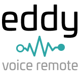
Logo for Eddy Voice Remote, which is a SaaS for voice and internet of things.

I am updating the logo to show that eddy is friendly, clean, warm, and focused on voice. I wanted the font to have character like a person. Eddy is part of Tiny Electrons but I wanted to give Eddy it's own logo as the domain will be eddy.tinyelectrons.com . User know Eddy Voice Remote as just Eddy.
I plan on using on a part of this logo for the header, so I will remove the Voice Remote slogan and only have eddy + sound icon in the main website header. I want to use the sound icon as a favicon.


5 Comments
I kinda feel like the waveform ought to be over the wordmark instead of under it. And is there a way you can draw it so that the waves spike up and down between the ascenders of 'dd'...? The placement here seems awkward. Also, line up the circles so they're level with each other, the one on the right sits higher than on the left.
It might be cool if you could record your voice saying the word "eddy" and draw a rough approximation of the waveform. Just an idea.
Your font isn't bad. It's clean and friendly, but it lacks distinction. If you wanted to give it character, I think you could do better.
It's a starting point but you've got some work to do yet.
Thanks so much for your feedback. I agree with what you said. I couldn't figure out the wave form to be in between the dd. I tried but something was off. I really liked that font but you are correct, it does need more details to give it more character. I found another font and changed the wave form to digital wave form and that seemed to do the trick to fit it in between the 'dd'. I did record eddy and the wave form was Up and down but because it was so short it was difficult to see the form. I updated the logo. Thanks again for your feedback.
I refrained from giving this one thumbs before but you've earned them now. This new one works much better, more refined. I like how the waveform being right-side-heavy is balanced by the subcopy pushed left. This waveform is better drawn than the first version, and more detailed without being cluttered or overly complicated. Teal and black is a classic combination. The font is nice too, I like the angled serifs on the 'dd'.
Just a couple little tweaks and I'd say you've got a winner:
That one teal bar crowds the first 'd' just a bit, raise it up a so there's a little more space, like the second 'd'. Then add one more little bar at the beginning and end of the waveform, so the symbol is the same length as the word. I kinda think 'remote' needs a little more space to the right so it's not so close to the 'y'... leave its position on the left but shrink it ever so slightly toward the left, just enough to make a little more room.
Good work here.
I agree with everything said above! You really made some great choices to improve this logo over version one! Fix those tweaks mentioned and winner winner chicken dinner! =)
Have you thought about integrating " eddy " into the waveform and have both in one?