EdgarSacadura design
EdgarSacadura | Sun, 02/22/2015 - 21:02
Brief from client
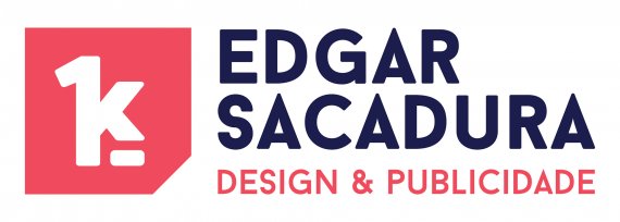
This logo is for a independent worker, that want to be recognized by a symbol more than by is name. The symbol needs to be very easy to recognize, remember and need to include is phylosophy: 1 C / 1 K that means "one customer at a time for one thousand happy" the symbol has a mix of straight with round because his personality is flexible and friendly but very professional.
P.S. My English is not perfect, so it is possible that the text contains errors or is not accurate


9 Comments
Um cliente de cada vez, para mil felizes "one customer at a time for one thousand happy"
Hi Edgar. Overall I like this logo. I like the colours and the type and also your justification for the 'mixture between round and straight' on the symbol.
I'm slightly unsure of the symbol's meaning though. I understand what you're trying to say and why, but is it something that should be so literally translated into a graphical device? I'm not sure. You've turned what would usually be a strapline into a main graphical device. Others may disagree. On its own, it just says '1K'. Is it strong enough to say and stay in people's memory that this is the visual identity of Edgar Sacadura? I think that it is in an ideal world, but in the real world with so many visual identities and brands fighting for people's attention, does it stand up as an identity for a designer? I am being hypercritical here and I do like the whole thing a lot. I think it could and does work to an extent, but maybe you should ask yourself the above questions is all i'm saying. I'd be interested to hear other people's views on this.
Also, slight kerning work needs to be done on the type of your name.
I'd also (personally) address the sizing 'issue' as displayed below. If anything, I'd settle for the 'A' being bigger than the rest of the type instead of the other way round.. in my humble opinion.
Overall - like it a lot Edgar =)
Thank you for your opinion i´m working on kerning and size and i think it looks better. i will post the new version :D Thank you!
As Jon said, I'm really liking this logo overall, but I don't get the symbol. Now one will read "1 cutomer at a time bla bla..." if they're not told about it. All I read is 1K and it seems to have to connection with the brand name.
If you don't want a basic symbol made from the brand's initials (and you'd be totally right) try to come up with something more abstract, but still relevant. Remember that a logo shouldn't be as informative as it should leave an impression.
Good job so far! Keep it up.
I tottaly agree with you, and in general i would make another symbol, but in this particular the symbol is part of Edgar signature and a personal "motivational" image. I will make some alternatives and see if i can connect with them
Quick question: who is Edgar? Because you speak at the third person, as you were working for him, yet your screen name is the same as in the logo. =)
Yes i understand the question... i have some issues that make me (sometimes) speak in third person... To clarify Edgar is me. Sorry for the confusion
It's alright =) Ho, I didn't mention it before but you might want to fix that kerning.
I´ve already fix it, could you go and see version 2 and give me an opinion?