Brands of the World is the largest free library of downloadable vector logos, and a logo critique community. Search and download vector logos in AI, EPS, PDF, SVG, and CDR formats. If you have a logo that is not yet present in the library, we urge you to upload it. Thank you for your participation.


7 Comments
I think the whole design is just to sloppy, also the colors are not working for me. Before I read the description my first thought was this was for a fudge factory or something in that nature.
Not really a kind of design that is showing your creativity & skill as a designer and illustrator.
You need a better creative idea and a different overall look if you want to present yourself like a person who knows what he is doing.
Caro companheiro, de facto não se percebe lá muito bem a sua ideia tanto o Tx como as cores não dão qualquer vida ao logotipo e por consequência em termos gráficos ficará sempre pobre.
Cps e boas ideias.
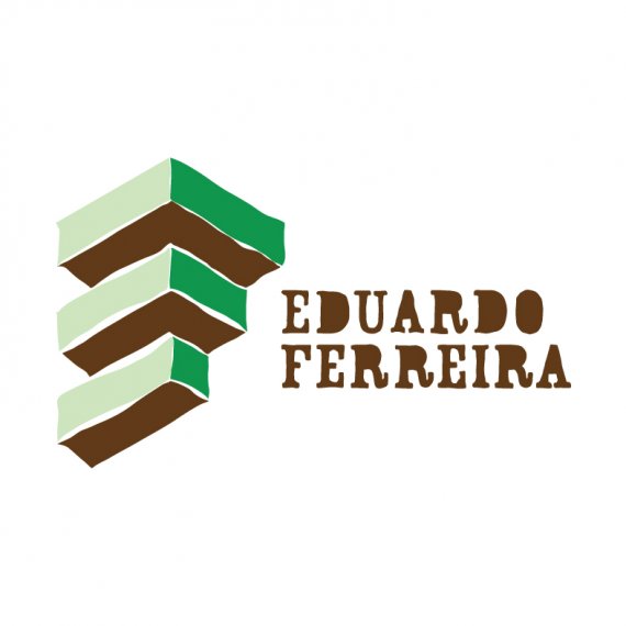
The only thing I like here is the idea of the "EF" but hate the execution.
That symbol has potential. Make the lines straight and it's going to look better
Clean it up- and you may have something :.
The E/F symbol is interesting, but take more time to integrate the name/typography into the design. You could make the E/F symbol cleaner, but maybe that look is hinting at your illustration style? The E/F symbol doesn't hint to a font that has serifs, so I see a san serif typeface for the name working better. Or you could try more elegant/traditional serif typefaces for the name (a good contrast to the symbol).
I agree with all observations. In fact is a bit raw. I need to think better of it. Thank you all!