Eight Arrows
Alex Overflow | Wed, 11/04/2015 - 21:53
Brief from client
A simple logo is needed to match the company name. No specific color needed, as we will be putting logo on various colored garments.
I'm new to logo design so any help and criticism would be greatly appreciated! At the moment they deal with screen printing and embroidery. The logo is meant to be used with any color ink on any color garment. The wording can be removed for smaller left chest designs or anything else where just the logo will be all that's required. Plan is to move into other forms of design rather than tshirts such as selling paintings and jewelry and a multitude of custom creations. Please let me know your thoughts!
TL;DR Simple logo with no specific color, they make shirts, but will eventually sell more than shirts.
7 Comments
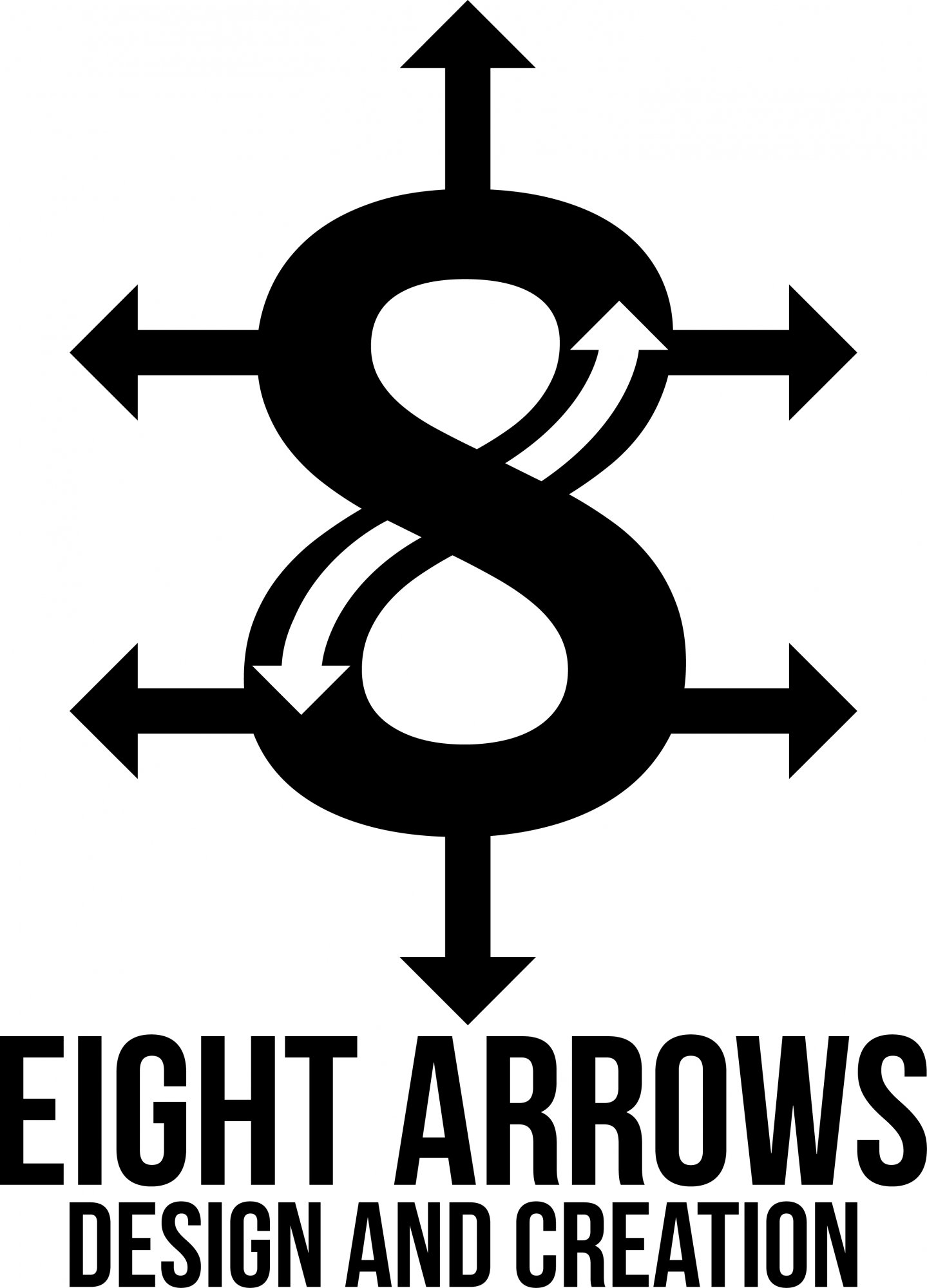
Everything looks very cold and industrial. I thought of traffic, architecture and construction. There could be something good in this idea of combining arrows with a figure 8, however right now this isn't working for me at all. It just looks like you enlarged an "8" in a bold font, then added simple arrow shapes. It doesn't look like a lot of planning went into it. Basically I think there is probably a clever way to create this shape/symbol, but right now this looks like something you'd jot down real quick to remember your idea- not the final product.
For instance the 8 tapers in at certain points and is not one stroke thickness all over...this unevenness causes a lot of visual tension in the middle where the white arrows show off the different widths. I'd make the 8 one solid weight, no italics. Also right now the balance feels off with how skinny and long the arrows are compared to the thick 8. Play around with those sizes more. Also, though I think this straight strong solid look could work, try creating one where the arrows are more organic and fluid and point in different directions. Maybe they can point towards each other in a way that makes your eye "swirl" around the figure 8 instead of looking like they're just impaling it.
Lastly the font is really aggressive and strong and doesn't feel to me like it fits this fun creative company you're describing. It again makes me think construction and industrial.
Thanks so much for the input, I'll definitely rework it a bit using what you said and post something in the future when I feel I have something better. Really great review, thanks for the help!
Katelin basically nailed everything about it that I was going to mention lol.
I dunno why not have a nice font from font fabric or something, type an 8, draw an arrow through it instead of inside it and on the corners and work from there. I have no clue on how that would look but it would probably cut down on the size while giving the same general idea. Or just take out the arrows on the sides. Just a thought.
Kind of wish this was in another color as Kate stated it looks very cold for a design company.
The symbol and font can be smaller, the symbol more so than the font since its very tall atm. Good attempt though :)
It is kind of like barbed wire designed to keep people away.
The symbol looks very aggressive with these pointy arrows popping out everywhere.
Pro tip: it's not because the name of the company is "8 arrows" that you have to show 8 arrows in your logo =)
there's too much going on with the symbol
According to the above, I believe that this symbol gives the impression of attacking everything in its path.