ELEPHANT AND MICE
juanellodiaz | Wed, 11/27/2013 - 20:52
Brief from client
The idea of the client is to create an agency of designers to work as external companies design area, outsourced design. The main idea is to sell that it is a team that will design big things.
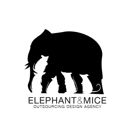
The elephant represents the project of the future client and the mice represent the team of people that coordinates to create big impact.
4 Comments
Great concept. Needs simplifying. I would omit the fur on the mice and much of the detail. The typography, on the other hand, is too simplified. Switch up the font so that the title and the description are different - or make the word 'Elephant' extra bold.
Wow. I think you did a great job on the negative space, I would like to see a better stronger typeface. But overall this is really cook!
Sorry to be the party pooper here, but while using negative space is always a good idea, this particular logo is nothing new. The Kölner Zoo has practically the same one. And with a quick search for "negative space logo" on Google, you can spot several similar ideas.
I don't think the whole mice/elephant thing is working. In most people mind, mice tend to scare the hell out of elephant and will tend to see a rather negative interaction between the two. I personally find that the ice are too detailed and look a bit creepy.
I'd start this one over.
Good luck!
You could keep this idea only if you take a more joyful/playful approach, something almost cartooney, like animation characters, simpler and more curved lines...and definitely remove the fur from the mice, those are rats...The type also need to gain some weight. Looking forward for the next version.