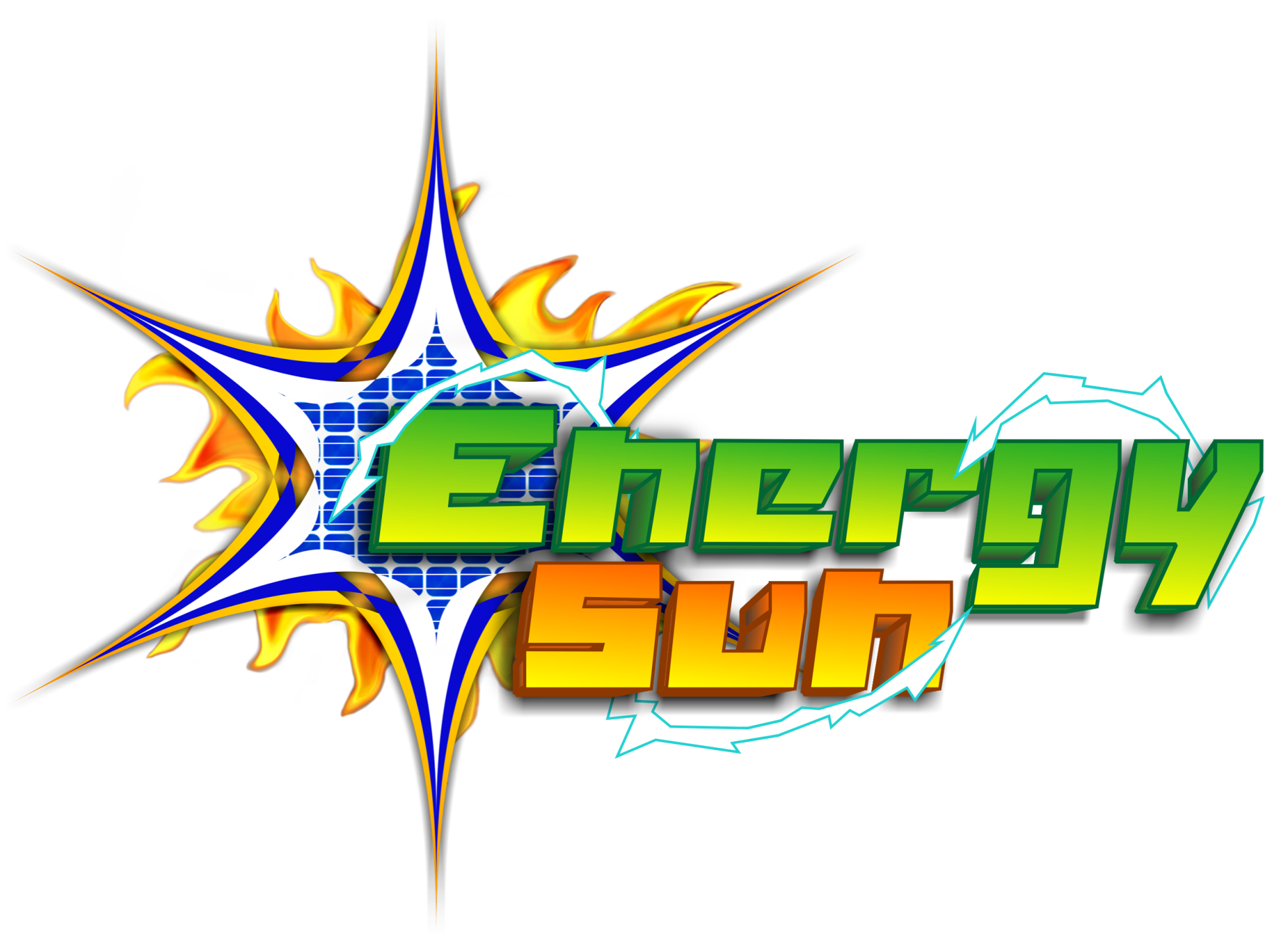
Energy Sun
Blitzkrit | Mon, 07/08/2013 - 16:12
Brief from client
they will sell better solar panels
and they want these colors because:
orange = the sun
green = ecology
blue and white = israel
the company will be of Jews
so this actually must be more serious i guess
and i know my logo is not basic or serious also if u want to say this is shit ok, actually i'm bad trying to do simple logos...
so actually if any good idea to do a better new logo will be ok
this is not the final concept so can be anything else
or getting better this logo... if is possible anyway
you experts can you help me?
just i need some good idea for these colors...
and maybe... i was exaggerate with the logo jaja i know but that i'm or don't u?
4 Comments
hmmm. Well you said you were bad at simple logos but this is just too busy. The shading in the fire doesn't match the star. To be honest I wouldn't put fire or electric in the logo at all. I feel as it cheapens everything unless its perfect. The 'u' in sun has a weird curve on the tail which is very pronounced with the 3d. I think you need to re-evaluate what this company is trying to portray. To me this looks like a soft drink logo.
the business is solar panels but they want these colors
some good idea? i mean just say what should be in that logo
anyway i will try again not big deal
As MDCasino said, way too busy/complicated.
To me, it looks more like a logo for a smartphone game than anything else.
You need to simplify drastically.
I agree with all comments.