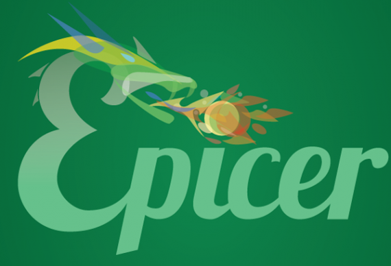
Epicer
jefzor | Tue, 03/15/2016 - 21:16
Brief from client
Young IT company, focus on a young, male, geeky public.
Name: Epicer
Color: Dark green
Intended use: Mainly online, usability in print isn't that important

I know it's still rough, and needs to improve a lot. But I'd like to get some feedback before I start polishing.
Symbol: They liked the idea of a dragon, I'd like to go for this abstract-ish graphic gradient style. Not sure if I should stick with it or if it's too 2012.
Color: I'm not liking the green color, I'd rather work with a dark gray / orange combination. Should I convince them to drop the dark green, or adapt the fire colors to somehow fit with it?
Typo: The curly "E" fits with the dragon head, if I go for a sans serif, I'd make a separate drawing.


2 Comments
Sorry, but this is not working for me.
The dragons is way too complicated. You can't even recognize it's a dragon from the thumbnail version. There are too many elements floating around, it's just too messy.
Also, you are better off never EVER using Lobster. It was cool a few years ago, now it just belongs in the Comic Sans/Papyrus/Impact category. It's been way overused since it's free and it just makes everything it's used on cheap and amateurish.
Globally, this is not a logo I would expect for an IT company. I don't want to sound too harsh, but it looks more like a Counter Strike team logo.
I think you need to get back to square one, do some research on IT logos and sketch a lot in order to find something viable.
Good luck!
Points well taken, back to the drawing board.