Era92 Studios
Era92 Media | Fri, 03/21/2014 - 09:46
Brief from client
This is ma company as a person, i am a self trained Graphic Designer
i would life to hear from you with constructive Criticism
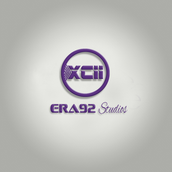
Era means a Generation
92 its the year in which i was born
In brief its ma Generation
So thats where i go the inspiration to call it era 92 Media
in the Logo i used XCII in Roman numerals to represent 92
Please advise me i want to come up with a perfect Logo
2 Comments
Start by removing all the terrible and useless effects such as drop shadow and bevel/emboss. Never use them, it's very amateurish.
What is this logo supposed so say? It's pretty vague, it doesn't give much clue about what your business is about ("studio" could be anything)
I like how you combined a bold modern font with a scripted one. But the type you used for "era92" is pretty bad. It has this kind of cheesy futuristic aspect to it. Same goes for "XCII" with the additional problem that people will read it as letters rather than roman numerals, because the last two numbers look like an i.
All in all, for a self trained designer, this is too bad. You have a sense for composition. We regularly so proclaimed "professionals" who can hardly do better.
Keep posting your work here, we'll be happy to help. Check these sites out for inspiration: www.logopond.com www.dribbble.com. Also, get a Pinterest account, it's very useful.
Thank you for making the effort to write in English (it's "my" not "ma" =)
Good luck!
Thank you Shawali.....
Am going to do the needful