Brands of the World is the largest free library of downloadable vector logos, and a logo critique community. Search and download vector logos in AI, EPS, PDF, SVG, and CDR formats. If you have a logo that is not yet present in the library, we urge you to upload it. Thank you for your participation.
estudio juridico santa fe
Daro Pérez | Thu, 07/19/2012 - 05:47
Brief from client
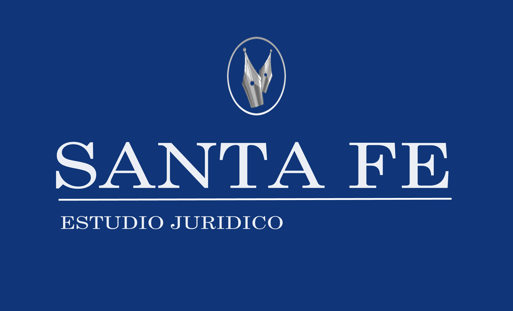
el color azul implica lo moderno y joven mientras que las plumas fuentes hace referencia al notario y al letrado
las letras fueron elegidas por la elgancia y sobriedad
OK, i can see an improvement here. Align estudio juridico with "santa fe". I would go with some sans serif on this but this font is also ok. The one thing that bothers me is the oval of the symbol, it gives me the impression that is badly distorted. Try with a perfect circle. Oh and the nibs are much better. Good job here.
This is looking pretty good, I am not a huge fan of the font and it has some alignment issues with the main line and the text divider and tag line try to get everything a little cleaner. I like the oval i don't like how it appears to ave a gradient, maybe lighten it up, or maybe even try a round circle. Colors look nice appealing and easy to my eyes.
2 Comments
OK, i can see an improvement here. Align estudio juridico with "santa fe". I would go with some sans serif on this but this font is also ok. The one thing that bothers me is the oval of the symbol, it gives me the impression that is badly distorted. Try with a perfect circle. Oh and the nibs are much better. Good job here.
This is looking pretty good, I am not a huge fan of the font and it has some alignment issues with the main line and the text divider and tag line try to get everything a little cleaner. I like the oval i don't like how it appears to ave a gradient, maybe lighten it up, or maybe even try a round circle. Colors look nice appealing and easy to my eyes.