Brands of the World is the largest free library of downloadable vector logos, and a logo critique community. Search and download vector logos in AI, EPS, PDF, SVG, and CDR formats. If you have a logo that is not yet present in the library, we urge you to upload it. Thank you for your participation.
Version history
Version 1

- I
- S
- T
- C


12 Comments
Cambio de logo para un laboratorio farmacéutico
English please. If your post isn't translated in the next 24 hours, it will be deleted and your account terminated. Let everyone enjoy the conversation please.
Gracias!
marvinporti11o, si vas a postiar aquí es mejor hacerlo en Inglés.
Shawali, chill out bro, instead of laying down the hammer like that give the kid some insight on how the site works and help to point him/her in the right direction instead throwing out threats.
--
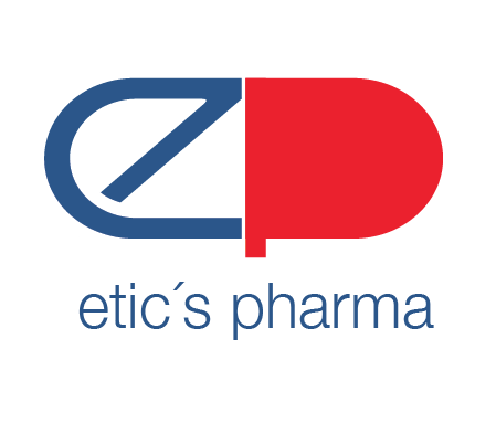
Regarding the logo, I like the idea of the pill. However, it's hard to see since the E and the P look very disconnected.
The E and the P don't have anything in common, try creating some conjunction between the letters.
The other this is that the stem of the P may be too small, so in small sizes it may get lost. However, I can tell that the stem is short on purpose in order to maintain the aspect of the pill. But then you need a way to figure out how to improve the legibility of the P while maintaining the integrity of the pill.
Also, the E has some issues where the bottom curve starts, it doesn't look smooth. The thickness of the whole letter is not even, address that issue as well.
Overall I think you're on to something, you just have to keep iterating.
Buen trabajo marvinporti11o.
Not good.
Idea is not bad but you need to "solve" the shape of the logo. Try to make thicker the letter "e" and make it more round to see it. Good luck
La idea no esta mal pero necesitas "resolver" la forma del logotipo. Prueba con hacer más gruesa la letra "e"y hazla mas redondeada a ver que resulta. buena suerte.
I like the general concept of the graphic. Does need some work. Not digging the typography of the name as it looks unbalanced from the graphic, not to mention "expected." I'm on the fence with the colors as well.
It's a great start!
If you are going to do a pill- I feel the letter E and letter P should be the same style. Not filling in the counter of the P would help them look similar, as the E should be able to fill the shape you need on that side. Once that is worked out try to use the same font for the title. This will tie them together, as now they are disconnected. I would suggest a color change (maybe green and blue) but I am not overall bothered by what you have, it is just not very interesting.
Then scale- either make the title a bit larger than the symbol, or equal in length to the logo- here it is only slightly smaller and it seems accidental.
I hope this helps. You have a nice place to move forward from!
Thank you for your request.
If you are cut inside after red shape may look better.
Maybe you could make the 'e' match the brand font a bit more, that slant angle looks harsh. But overall I think that it's a strong design.
it works! I like your idea. I would like to see it a bit more elegant. Is there a briefing of that colour? And .. be careful of that letter e. It looks like one of germanys big players - https://www.deutsche-bank.de Well done.
I'd try a solid shape for the e, maybe do a cut out. maybe do the p as a line since it has the whole shape. that slant on the e isn't working. Typeography really not working.
Thanks for the request.
This logo has potential but there is a lot of details that requires more experimenting.
Symbol: interesting idea, but pay attention on the space between the two parts of the pill and the end of the letter e. They has to be the same. Also, at the top of the letter E you have rounded corner. You should decide if you want rounded or sharp corners and make them all the same.
Typography: I suggest to take font like Montserrat, all caps, and move it on the right side of the symbol.
We are expecting new version of the logo.