Brands of the World is the largest free library of downloadable vector logos, and a logo critique community. Search and download vector logos in AI, EPS, PDF, SVG, and CDR formats. If you have a logo that is not yet present in the library, we urge you to upload it. Thank you for your participation.
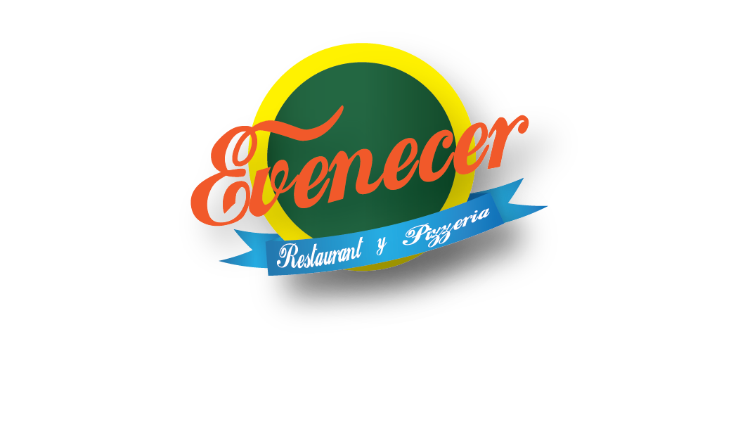
Firstly, these colors really don't go well together. The orange font on the yellow and green background is barely readable. Also, is it a Brazilian restaurant? Because that's kind of what these colors say.
Talking about the main font, beside the bad tracking, you're missing the ligatures. Free font like these rarely come with ligatures, so you'll have to create them yourself. Check out this site, it could help in that regard: www.iloveligatures.tumblr.com
The subtext part is a mess. It's never a good idea to have more than 2 fonts in a logo and then again, they really have to complement each other (check this out: www.typography.com/ask-hfj ). But 3 different cursives, including 2 bundled up together on a ribbon, it's just not possible. You need to simplify, one font for the brand name and one for the subtext. And look for better types than these. Dismiss most of everything you can find on DaFont and check out www.losttype.com orwww.fontsquirrel.com
Globally, this logo just goes to show that you worked directly on the computer and did not process some ideas by way of sketching before hand. Always start with inspiration from other poeple's work ( www.logopond.comwww.dribbble.com ) and then use a pen to throw some ideas on paper. Only when you come up with something you like that you can use the computer only for execution purposes.
One last thing. On this site, please try to stick to English when you present your work, however briefly. There are people from all over the world who can give you some feedback, but most of them don't speak Italian.
From what I understand from your description, though, is that your client seems to be ok with this logo. Well, this is NOT ok. "The client really likes it" is a bad excuse for botched work and a pitfall too many young designers fall into. The client isn't supposed to have good taste, let alone knowing anything about design. That's your job, and as a graphic designer, to convince him that you know better than he does.
Sorry if I've been a bit too prosaic. I hope that helps, though.
Empecemos: no hay concepto.
los colores lastiman la viste y ni siquiera combinan, están muy mal usados.
La fuente es terrible: usar loki-cola no le da aspecto vintage ni nada, solo te da la idea de que bajaste la fuente de coca- cola porque lobster ya esta muy usada. Error. Personaliza la typografía, busca una nueva, dibujala tu mismo.
el circulo del fondo solo se ve como un circulo en el fondo y el gradiente en el verde no le da profundidad ni nada por el estilo, solo hace que todo siga teniendo ese look de: "no se que estoy haciendo."
el banner azul, donde la palbra pizzeria queda aplastada... mmm no funciona al igual que las letras blancas sobre turqueza, puede en casos funcionar, este no es uno de ellos.
Creo que la composicion que tenias en mente es buena, es clasica, pero lo que lograste esta lejos de ser algo bueno. Vuelvelo a intentar, simplefica algunos elementos pero hazlo más uniforme, hazlo que funcione como un todo. ¿y que te parece si usas texturas sutiles en lugar de sombras y degradados?
4 Comments
This is not really looking good, unfortunately.
Firstly, these colors really don't go well together. The orange font on the yellow and green background is barely readable. Also, is it a Brazilian restaurant? Because that's kind of what these colors say.
Talking about the main font, beside the bad tracking, you're missing the ligatures. Free font like these rarely come with ligatures, so you'll have to create them yourself. Check out this site, it could help in that regard: www.iloveligatures.tumblr.com
The subtext part is a mess. It's never a good idea to have more than 2 fonts in a logo and then again, they really have to complement each other (check this out: www.typography.com/ask-hfj ). But 3 different cursives, including 2 bundled up together on a ribbon, it's just not possible. You need to simplify, one font for the brand name and one for the subtext. And look for better types than these. Dismiss most of everything you can find on DaFont and check out www.losttype.com orwww.fontsquirrel.com
Globally, this logo just goes to show that you worked directly on the computer and did not process some ideas by way of sketching before hand. Always start with inspiration from other poeple's work ( www.logopond.com www.dribbble.com ) and then use a pen to throw some ideas on paper. Only when you come up with something you like that you can use the computer only for execution purposes.
One last thing. On this site, please try to stick to English when you present your work, however briefly. There are people from all over the world who can give you some feedback, but most of them don't speak Italian.
From what I understand from your description, though, is that your client seems to be ok with this logo. Well, this is NOT ok. "The client really likes it" is a bad excuse for botched work and a pitfall too many young designers fall into. The client isn't supposed to have good taste, let alone knowing anything about design. That's your job, and as a graphic designer, to convince him that you know better than he does.
Sorry if I've been a bit too prosaic. I hope that helps, though.
Good luck!
There is no idea in this logo. The elements are a mess together and the colors do not gel. Start over completely.
Very Wise Words @Shawali
Empecemos: no hay concepto.
los colores lastiman la viste y ni siquiera combinan, están muy mal usados.
La fuente es terrible: usar loki-cola no le da aspecto vintage ni nada, solo te da la idea de que bajaste la fuente de coca- cola porque lobster ya esta muy usada. Error. Personaliza la typografía, busca una nueva, dibujala tu mismo.
el circulo del fondo solo se ve como un circulo en el fondo y el gradiente en el verde no le da profundidad ni nada por el estilo, solo hace que todo siga teniendo ese look de: "no se que estoy haciendo."
el banner azul, donde la palbra pizzeria queda aplastada... mmm no funciona al igual que las letras blancas sobre turqueza, puede en casos funcionar, este no es uno de ellos.
Creo que la composicion que tenias en mente es buena, es clasica, pero lo que lograste esta lejos de ser algo bueno. Vuelvelo a intentar, simplefica algunos elementos pero hazlo más uniforme, hazlo que funcione como un todo. ¿y que te parece si usas texturas sutiles en lugar de sombras y degradados?