Event speciale
Brief from client
Company Profile | An introduction to your Company
> What is the significance of the company’s name?
>> Conceptualizing and organizing special events – hence Event Speciale.
(Ex. company celebrations, milestones, annual day, conferences, etc.)
> What is the work process or philosophy?
>> There is no fixed formula used for ever event; instead a personalized / customized event is planned and created based on the client’s need.
>> The objective is decided, an event is planned around a concept / theme and hence its an experience and not just an event.
> What are the services provided by the company?
>> Core Service - Corporate Hospitality & Events
>> Core Competencies - MICE (outdoor), Experiential Marketing, Live Concerts and Brand Activations.
>> Most events are large scale and for employee engagement.
>> No birthday, marriages, etc.
>> The events are planned from scratch and not just managed / co-ordinated.
> Describe the company’s business and industry sector.
>> MICE – meetings, incentives, conference, events (corporate events only).
> Describe the kind of company Image that you want to project.
>> To project Event Speciale as a Brand and not a Proprietary firm (currently, clients associate the firm with the owner).
>> Present a cohesive brand I mage at every touch point.
> Company Strategy
>> Essence – Customized Corporate Hospitality & Events.
>> Vision – Think specialized events, think Event Speciale (size and scale will automatically fall into place).
>> Mission – Consistently devise personalized event solutions, for maximum delight and ROI.
>> Personality – Not young but creative. Experienced people managing a team of enthusiastic individuals.
>> Values – Detail oriented. Go getters.
> Work strength & core group of the company – How do you want to be perceived?
>> “We are a tight setup, so we focus on you. We don’t have direct presence in other cities, but have alliances to get the job done.”
U.S.P. | What sets you apart from the competition
>> Understanding client’s need, creating and deliver a solution that works for the client and thus ensures ROI.
>> No run of the mill ideas, instead ideas that work and are impeccably executed.
>> Attention to detail, taking care for quality control at every stage.
> What are your weaknesses and how do you counter it?
>> Corporates usually want to associate with other established Brands (such as Wizzcarft, etc.)
>> Need more outlets, more staff and larger team eventually.
>> Sub-par Designs & PPT for the events are a sure weakness.
> What has worked for the company so far, and what hasn’t?
>> We are compact firm and we’ll focus on you and your needs.
>> Bigger firms don’t give a shit and we do.
>> Showing a network of alliances, instead of lying about offices.
Design solution
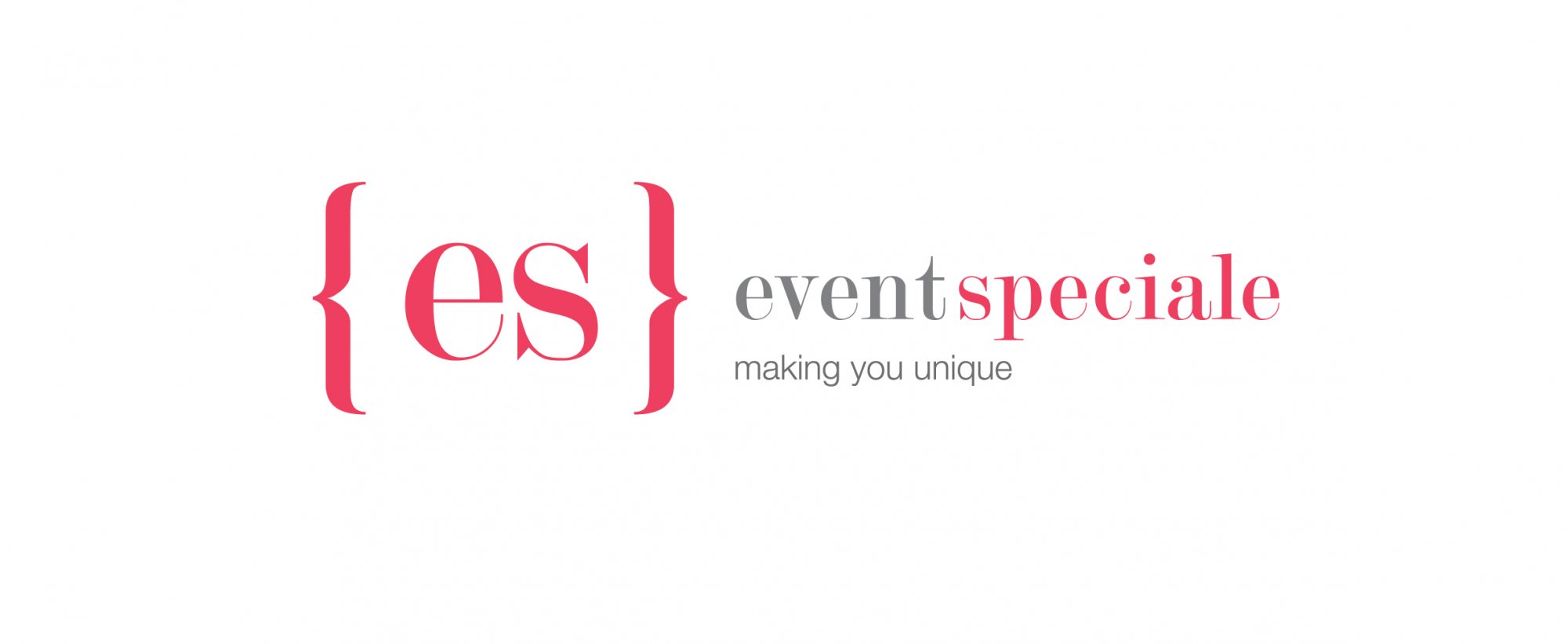
logo idea : the brackets connote - our focus - you / our client.
the use of lower case letters connotes an amiable approach.
{es} connotes - especial, you are special, to be special and also stands for EVENT SPECIALE
our focus - you
our philosophy - driven by our creativity, rely on our experience
our brand essence - customised / unique corporate events.
How to show we are creative + corporate + young?
the use of brand color, the brackets
interestingly for office interiors to
make the environment young,
energetic, inspiring & corporate.
Our Philosophy : Driven by creativity, we rely on our experience
11 Comments
the visiting card concept
I m displaying all the work done.
interior graphics
interior graphics
Everything is cool and stylish. I would though not be so stingy for colors. Look for example at Ncell logo you see that they have gradients of violet http://www.youtube.com/watch?v=AYLejmgmOAY&feature=BFa&list=UUa_d0IpR-s4...
In general the logo looks like taken out from Cosmopolitan magazine ads. That was my first thought. There is something wrong with kerning, b/c "spec"looks very close to each other and "iale" looks different. I would work on that. would also not put the texts on the business cards so close to borders.
Yes i have to agree with Alpreacher
agree with the above.
maybe changing the font to another one not thinner
Prepare to read!
I love the fact that you applied the layout to several settings. That way I can get a glimpse of what its used for. I will say though that even though you've written a very detail description about the logo, I tend to try to ignore that part first so I can get the purest sense of what the logo draws to me. That way you get an unbiased critique. But looking at what you're trying to get at I'll break down your logo according to your design solution you've given:
Design solution
logo idea : the brackets connote - our focus - you / our client.
the use of lower case letters connotes an amiable approach.
{es} connotes - especial, you are special, to be special and also stands for EVENT SPECIALE
I get all of this here. The lowercase letters is a nice touch and I like the font used. However, the brackets don't give me the focus on "me" per se but more targeted towards the word especial itself. the definition of especial is:
1. special; exceptional; outstanding: of no especial importance; an especial friend.
2. of a particular kind, or peculiar to a particular one; particular: your especial case.
And that is what I'm trying to find in this logo. In all honesty, it comes off as looking a little generic, since its fully text. Now call me crazy, but I would say come up with a more creative way to replace those brackets. That meaning, don't use text for the brackets, but come up with some sort of symbol. Alpreacher also was spot on with the logo being similar to something from a magazine. it comes off as very generic - you don't want that of course.
our focus - you
our philosophy - driven by our creativity, rely on our experience
our brand essence - customised / unique corporate events.
All of this stuff says here is basically SCREAMING "WE WANT TO BE UNIQUE! WE ARE DIFFERENT!" How can you make something look different? Unique? You will have to go with something out of the ordinary, something that doesn't look so generic.
Look up this site for some examples of excellent and unique logo designs. They all have one thing in common, that "quirkyness" or cleverness on words and symbol.
http://www.toxel.com/design/2010/03/03/20-unique-and-creative-logo-designs/
How to show we are creative + corporate + young?
the use of brand color, the brackets
interestingly for office interiors to
make the environment young,
energetic, inspiring & corporate.
You are targeting younger people? If that is the case then you are using the wrong colors, here is a good site on color psychology that will help you:
http://crystal-cure.com/color-meanings.html
Now have you seen any color that represents youth? I'll give you a hint, its NOT that pinkish color! XD The color you will want to go for is blues, some type of blue. It is not only the color used to target youth (facebook, twitter, etc.) it also is used for innovative companies (IBM, Intel)
Now that I've said everything I can about the logo, I will say that it is indeed an interesting concept. I only hope that you are able to understand my meaning on changing it to more suit what you're after!
Maybe I'll check on this one when I retire... don't have the time now to read through that brief.
I saw something like that somewhere...No comment.