ezootik
Daryu | Fri, 06/19/2015 - 03:39
Brief from client
This concept is way back my college days when my professor make us a design about any company logo. This concept is about exotic restaurant that have also can drink beer stuff like that.. just want to have critique to be able to improve.. thanks
just want to improve my designing skills so need help from you guys thanks....
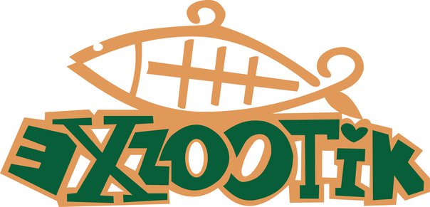
restaurant logo
2 Comments
Not too bad, I have to say.
The may problem is that you played around so much with the word mark that it's pretty hard to read. It's a bit too over the place. Try to keep things simple and get rid of the heart on the i. It's gimmicky and doesn't really serve any purpose.
Good job, though.
Generally its good, the colors are kind of boring and overall it looks like a children s thing. But since you were making it up then - design wise its good. You would just have to work on your ability to take in someone's vision and idea and create them something that is unique.