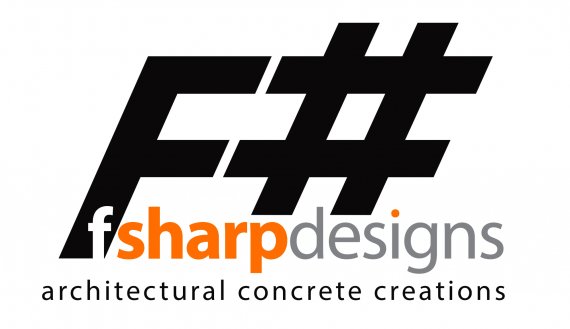
F# Designs
Brettannica | Fri, 02/21/2014 - 05:09
Brief from client
Design a simple and concise brand for an off-shoot of his concrete polishing business. The design needed to be created in one afternoon as he wanted to start advertising.

I wanted something bold, crisp and readily identifiable. The clients parent company’s primary brand colour is red, so I needed to keep a colour hue link to that.
F# Designs specialise in creating designer concrete furnishings and custom pieces such as stair treads, bench tops etc.
My timeframe was ridiculous, hence a purely typographical approach to solving my dilemma and the clients requirements.


2 Comments
"Design a simple and concise brand" - I find it complex and not very clear, also a logo is not a brand, but just the tip of the iceberg. The colour combination is quite strange (where's the link to red?) and the white-out f makes me think it's a company that has ties with facebook. Also, why the musical notation?
It's a shame he wanted to advertise later that afternoon. It just confirms how little value people ascribe to their brand.
I would try to get this logo reworked or getting rid of the big F+ (can't remember short cut for hash, lol) would be an improvement.
While I respect that you don't have a lot of time to complete this logo. I still would like to address some aspects of your design.
Your symbol, while straight forward, is simply too generic. I say this because it looks like you just typed "F#" in italics, made the # bigger and was done with it. You said your client does furnishings, concrete, stair treads, etc. All of which could be inspiration of what you can include in your design. See logopond.com or dribbble.com for even more inspiration on effective symbols and logo design in general.
Though your typography is all the same type (it looks like helvetica or arial) the fact that you have white text, orange text, grey text, black text, bolded text in some places, thin text on others, sometimes parts of the text are different colors (the i) etc. really makes the eye work hard to try to make sense on what your brand is saying. Stick with only one or two font types (A bold and unbolded OR an orange and a grey theme) and stick with that. The golden rule is to try to use 2 fonts in a design in order to find a good balance, but with all those random alterations to random fonts in your work, you literally made many more than that. Keep this in mind, Also losttype.com or fontsquirrel.com is a great place for a better designed font.
I didn't quite understand your meaning behind "keeping the color hue link", I suppose you mean a similar color to red, because I see that you used orange and not red. Either way using a warm color scheme is fine but what I addressed in the previous paragraph pretty much covers how I feel about your colors I think, so I'm not going to repeat myself lol. Check out kuler.adobe.com to get some inspiration on better colors and I reccomend sticking with pantones for a better less clashing balance. :3
P.S. If this client wants a logo to be finished in one afternoon he is either paying you a pretty penny for an entire re-branding, or he's not paying you enough and scamming you.. Either way, that's a red flag in my book for someone who doesn't know or respect how the design process works. I would expect at least 2-3 days for a thorough starting point in an effective brand and much more for a fleshed out idea that is effective (weeks).
Hope this helps and good luck :3