Fashionbowl
Anouk1989 | Tue, 02/26/2013 - 19:32
Brief from client
.
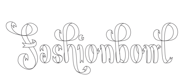
This is a hand vectorized logo I made for an ego blog that I want to start. It's a fashion blog where I want to post photos of my daily outfit. Should be a platform for me to connect to other people that are interested in this field and will probably also be available on facebook, instagram and so on.
The name fashionbowl is for the collection of my fashion items, the storage of styles and photos.
I chose the ribbon font to represent a playful, girly side because I don't define myself with only one style (in fashion). I'm very open and often wear things where I'd never thought that I would wear them a few months ago.
7 Comments
Sooooooooooooooooooooo estilized.
Very difficult to read. Fashionbont, right? More than girly, very romantic, sorry, it doesn't work for me.
if you love the idea maybe you should play with it more?
i think it is hard to read and i see Fashionbont as well.
Maybe if you had it colored and not black white it be easier but idk... I like the concept looks pretty cool but its hard on the eyes at first. like i mentioned maybe if you play with it color it in maybe get some shadows / gradients it will pop more, and since your only using it for online dont be afraid to get some color in there. The "w" needs work tho!
Its very hard to read....
This is off to greatness, but as they above comments pointed out, it's barely readbable.
I think it comes from the fact that the characters aren't ligatured, which is strange for a cursive font.
But props to you for the hand lettering, we don't see enough of these around here.
Its neat work but I can't read it even when you wrote down "Fashionbowl" I don't see it. It needs less curves for example on the F...maybe just have it on one end instead of both sides....it looks like deco you see on wallpaper or textile.
Thank you all so much for the comments! I will work on it when I have time and post it again!
Best, Anouk
You can try a bolder and plain font that says FASHIONBOWL and a stylized F or FB or FBL as a symbol. Maybe it could works and… ah, yeah, when you have the time, i almost forget it.
Greets