Brands of the World is the largest free library of downloadable vector logos, and a logo critique community. Search and download vector logos in AI, EPS, PDF, SVG, and CDR formats. If you have a logo that is not yet present in the library, we urge you to upload it. Thank you for your participation.
Version history
Version 1

- I
- S
- T
- C


1 Comments
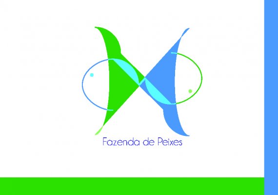
Ouch my eyes! You might want to switch the jpeg to CMYK, so the colors aren't so flashy.
Globally, this is pretty bad. The symbol is really weird. I'm pretty sure I won't be the only one to say that, but it just looks like boobs. I'm not sure what the overlapping part is supposed to say, but it looks way too random.
The text part is too small compared to the symbol.
What are these margins doing here? Are they part of the logo?
Basically, this logo looks like it's been done a few minutes on MS Paint.
Keep posting your work, though, we'll be able to give you pointers. For this one, my advice would be to start from scratch and get as much inspiration as you can ( check www.inspirationfeed.com www.lookslikegooddesign.com www.losttype.com www.dribbble.com )
Good luck!