Feira do Livro de Braga
fernandolucas | Wed, 09/12/2012 - 23:09
Brief from client
Create a logo for the book fair for the city to the north of Portugal (Braga)
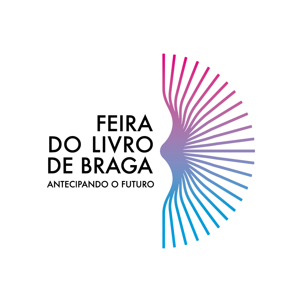
The logo for the book fair in the city of Braga.
Only the pages of a book in motion that forms the letter B
3 Comments
Love the colors!!
Nice stuff, but the gap between DO and LIVRO bothers my eyes a lot, you still need to work on that part I think.
I like what I see so far but it still need a little extra "Oomph". It could just be me, but having a logo on the right hand side bothers me. Also as oscar pointed out, check the spacing on your type. I LOVE your font choice though, but your spacing seems off between the words as he mentioned.
For the book, I'll be honest but I didn't see a "B" until much later. To strengthen the look, why not pull the cover pages ALL THE WAY back? That way you have a top and a base of your cutout of a B shape. It will also make it look more interesting and may help out with your left aligned text if its surrounded by the logo in this way.
Just my two cents.