Fengari
robmald | Fri, 11/08/2019 - 06:08
Brief from client
Doing a complete brand redesign for an apparel company with focus on Futuristic/Cybernetic elements. The design still needs some cleaning up, especially on the space craft and flame but I wanted feedback to see if we're going in the right direction.
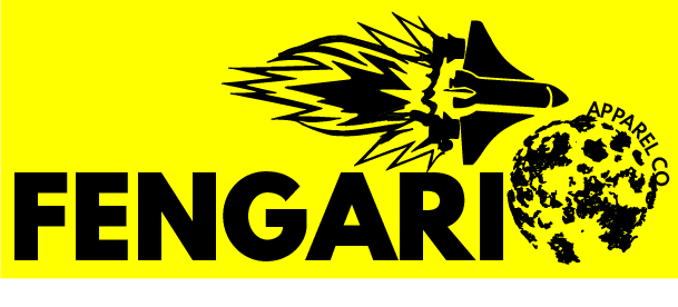
Bold font, space craft, and planet depicted in the logo. The yellow backdrop is not part of the logo, but we are testing color palettes so I'm seeing if it appeals to people or deters.
1 Comments
Don't let the red thumbs get to you or anything because as you said this is still a WIP and there's good stuff going for it.
Symbol: The space craft and planet make sense for the futuristic elements but, not much for cybernetic. This of course isn't an issue if cybernetic isn't needed. As for the symbols themselves I really like the grunge feel the planet has which could be a nice contrast against the futuristic theme which normally is super clean and modern. If grunge fits the apparel that is sold or would make sense as a contrast against it that would make for an interesting look against the generic clean looks most futuristic elements go for. Currently though the symbols clash against each other with one having the grunge texture and the other being clean shapes. Also another issue to be aware of is that having two symbols can make it too busy though you could have both if those two symbols are smaller or interact with each other such as having the planet as the dot above the "i" with the ship going towards it.
Typography: Right now the text is a bold font but that's about it. It's doesn't feel like it fits with your symbols very well and the kerning seems off such as the "FE" and GA". It could work with better kerning and different symbols but, I would look into new fonts and play around with them and see if anything else fits better.
Colors: As you said the color is just you testing it out and right now black and yellow doesn't scream futuristic or cybernetic to me. That may not be a problem since the color doesn't always need to do that but, yellow can be very straining on the eyes so I would avoid using large areas of it. Keep playing with color combos and don't stick with the black and yellow.
Hope this helps and makes sense to you.This could turn into something very interesting so just keep at it.