Brands of the World is the largest free library of downloadable vector logos, and a logo critique community. Search and download vector logos in AI, EPS, PDF, SVG, and CDR formats. If you have a logo that is not yet present in the library, we urge you to upload it. Thank you for your participation.
I really like the effort you put in in explaining your whole design but I don't think it works. The idea may work but too much is happening with the logo. Simplify it more.
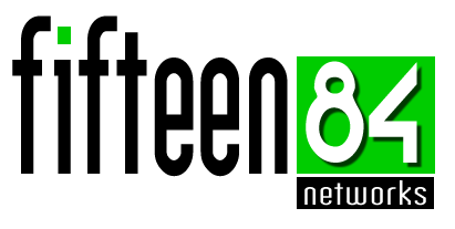
Could you explain more on the symbol "S". I'm afraid I don't understand it fully.
True complexion is black? Ummmm... I think that is a bit politically incorrect but I don't know.
this logo isn't memorable, and i dont think that its IT Firm logo's, theres too many fonts in your logo, use just 2 max for that.
The compotitions looks crowded, i think you can focus in Fiften84,make it more interesting and make networks become smaller, use simply font for that.
There is much information in this creation, I think you could condense your idea. Many different types and disproportionate, the text at the bottom may be illegible in certain applications. I liked the green but not contrast with the black, maybe a dark gray? .. And maybe also make this same green with a little extra mass.
I don't have a problem with the green and black but I would agree about the fonts. Also the 84 is way too big and the 8 looks like a snowman rather than a number. The separate 's' is irrelevant and makes the whole thing too busy. With logos, simple is best. The y have to go on letter heads, T-shirts, all sorts of thing big and small. Also 'Have it your way' is far too small compared to the rest of the design. Does it need to be there at all? Its their catchphrase not their logo.
Too much info - too much explanation for all the things in the logo, which is not necessary. Try doing it simpler; the less things - the easier to memorize. Colors are ok, but depend on the final thing you are going to do.
The effort put into the design is great, however it does not work for me.
You need to keep it closer together and more simple, there are to many things to try to focus on making it not a memorable logo. Great start, take the constructive criticism in the comments backed by your dedication and i think you could have a real outstanding logo.
um tanto confuso, é só perguntar a um leigo (ou uma outra pessoa que não é da área) para fazer uma interpretação da logo e escutar o que ela tem o que dizer do que ela entende. Ok? sempre uso isso como artifício, pois fazemos logo para a população em geral identificar, certo? Um grande abraço...
The only thing I really like about this piece are the colors, even though they remind me of HR Block.
The main issues as people have been saying is the type. The 'fifteen' is too stretched. (Height wise) The 8 seems to be manipulated in a poor way. The 4 I do not mind. Networks is fine with the 84.
Maybe there is a way to put fifteen with the 84 in a simpler way? One that is more cohesive and not as separate from the green/black box unity?
Maybe you shouldn't focus on basic typefaces and more on how you can manipulate the numbers to form as one being that some ends of numbers combine with others and connect the two.
Focus on how to make 15 and 84 separate entities but one logo.
I have not seen the previous versions, but I get the sense you've done a lot of editing on this logo. I personally am not a big fan of the neon green. Coming from a 4 color process print perspective, that color is more trouble than it is worth. My biggest issue is the word fifteen- I think it should be sized down so that the top of the "f"s line up with the top of your box.
Para ser un logo hay demasiado texto, un isotipo bien comunicado es lo que necesitas realizar para que no sea muy textual.... Te recomendaría que trabajes mas en el 84 como isotipo y veras que lograras una marca que tenga una buena comunicación de marca y diseño..
18 Comments
Check it out
I really like the effort you put in in explaining your whole design but I don't think it works. The idea may work but too much is happening with the logo. Simplify it more.
Could you explain more on the symbol "S". I'm afraid I don't understand it fully.
True complexion is black? Ummmm... I think that is a bit politically incorrect but I don't know.
All I can say is, make it simpler and tighter.
this logo isn't memorable, and i dont think that its IT Firm logo's, theres too many fonts in your logo, use just 2 max for that.
The compotitions looks crowded, i think you can focus in Fiften84,make it more interesting and make networks become smaller, use simply font for that.
There is much information in this creation, I think you could condense your idea. Many different types and disproportionate, the text at the bottom may be illegible in certain applications. I liked the green but not contrast with the black, maybe a dark gray? .. And maybe also make this same green with a little extra mass.
The Logo has much text, it`s need more image from the location it´s represents, and after more less text, the typefont text must be bold or extrabold
I don't have a problem with the green and black but I would agree about the fonts. Also the 84 is way too big and the 8 looks like a snowman rather than a number. The separate 's' is irrelevant and makes the whole thing too busy. With logos, simple is best. The y have to go on letter heads, T-shirts, all sorts of thing big and small. Also 'Have it your way' is far too small compared to the rest of the design. Does it need to be there at all? Its their catchphrase not their logo.
There is much information in this creation. Try to do something clean.
Too much info - too much explanation for all the things in the logo, which is not necessary. Try doing it simpler; the less things - the easier to memorize. Colors are ok, but depend on the final thing you are going to do.
Sorry for the choice of words, but this is a mess.
too much going on and doesn't fit right. scratch this and start fresh.
The effort put into the design is great, however it does not work for me.
You need to keep it closer together and more simple, there are to many things to try to focus on making it not a memorable logo. Great start, take the constructive criticism in the comments backed by your dedication and i think you could have a real outstanding logo.
um tanto confuso, é só perguntar a um leigo (ou uma outra pessoa que não é da área) para fazer uma interpretação da logo e escutar o que ela tem o que dizer do que ela entende. Ok? sempre uso isso como artifício, pois fazemos logo para a população em geral identificar, certo? Um grande abraço...
The only thing I really like about this piece are the colors, even though they remind me of HR Block.
The main issues as people have been saying is the type. The 'fifteen' is too stretched. (Height wise) The 8 seems to be manipulated in a poor way. The 4 I do not mind. Networks is fine with the 84.
Maybe there is a way to put fifteen with the 84 in a simpler way? One that is more cohesive and not as separate from the green/black box unity?
Maybe you shouldn't focus on basic typefaces and more on how you can manipulate the numbers to form as one being that some ends of numbers combine with others and connect the two.
Focus on how to make 15 and 84 separate entities but one logo.
like the other pips said, the fifteen is too stretched vertically, and the logo doesnt reflect an IT firm. Any way the 84 is quite cool
Please upload it in another window. this version is much beter but you have to do it beer
I have not seen the previous versions, but I get the sense you've done a lot of editing on this logo. I personally am not a big fan of the neon green. Coming from a 4 color process print perspective, that color is more trouble than it is worth. My biggest issue is the word fifteen- I think it should be sized down so that the top of the "f"s line up with the top of your box.
i also have t say that the fifteen is a little too strecthed out and the "84" looks almst insignificant nxt to it..
Para ser un logo hay demasiado texto, un isotipo bien comunicado es lo que necesitas realizar para que no sea muy textual.... Te recomendaría que trabajes mas en el 84 como isotipo y veras que lograras una marca que tenga una buena comunicación de marca y diseño..