FIve CIties Breakers
thebestconnect | Mon, 01/21/2013 - 04:57
Brief from client
Jacket Designed Art
-Nathan Garcia 2013
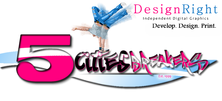
Designed By: Nathan Garcia
Pismo Beach, Ca
Jacket Designed Art
-Nathan Garcia 2013
Designed By: Nathan Garcia
Pismo Beach, Ca
7 Comments
I don't really know where to begin...
First, don't put 2 logos in there. That Design Right thing has to go, it doesn't say anything relevant to help us giving you feedback and it disrupts everything.
Now, that logo looks very dated, straight from the early 90's, I'd say. I know the 90's are the new 80's and they are hip right now (look at all these shitty boys bands getting back together =) but when it comes to graphic design, it's better to live with our times (which are awesome for logo design as opposed to the atrocious 90's).
There are too many fonts, all of them bad. That graphitti typeface may be tempting on when you're on DaFont and you got a hip hop/urban style of logo to do, but trust me, it's really not. The font itself is a mess and you didn't improve things by applying different sizes to each character. Definitely not a font for logos.
That 5 also screams "free font!!" and is really weird looking.
That white slash crossing the whole logo makes things barely readable and has to go. So does that terrible, but too often seen drop shadow effect. This is kind of a big rule of thumb : never ever use a drop shadow effect. In fact don't use any effects at all, if it's just for the sake of having one. I know one might thinks that it looks cool when one is a beginner, but it's really not. The strokes around "city" and "breakers" also complicate things further.
The colors might be the worst part. The whole 90's feeling stem from them. Almost fluorescent pink and watery blue gradient. Urk...
The symbol shouldn't be a picture, even if you trace it. It's just too many details, which complicates the logo which is already overwhelmed. Keep it simple. If you want to have a break dancing guy, at least go with a silhouette.
Sorry if I'm a bit harsh, but I'm being honest. This is a really bad logo.
If you want to find some really good and professional fonts, check out sites like www.losttype.com www.fontsinuse.com and www.typophile.com (you won't be able to download fonts from the last 2, but you will learn a lot about them)
Good luck!
what he said.
Seriously?
wooohooooo
This is just a 'start over' deal.... And remember: SIMPLE. Keep it simple. And try not to do anything in the new one that you did here, because this is simply a mess.
I could just plagiarized what shawali said because it deserves a repost here but I wont do that. And did I see Est 1999? Now it ALL makes sense!
Anyways um you would have to rethink on the logo's name among other things and work on that, best bet is to get some inspiration from google on "great logo designs" and there's always an option to hire a designer if this is for a client :)
thanks everyone.