Floristeria Casa Club
tjwl1989 | Sat, 03/09/2013 - 18:09
Brief from client
The client was looking that the design was young and attractive for a flower shop.
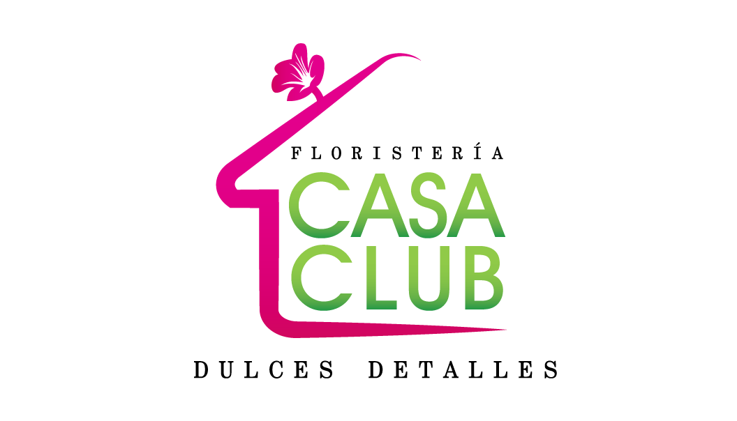
So we use the shape of a house with a little flower in top like a smokestack.
8 Comments
i really like this logo, great idea men.
dont get the idea!!! i thought that is a real estate company in the beginning!!! but when i read the brief, no way this is a flower shop...
think again..
and if you want a young and attractive design, i think u need to put more colors and mix elements (for example, mix some flowers (2-4 ones) silhouette with different colors to form a big one)
....just a suggestion
Looks good, i like the main idea. Try to do something with the black line of text from bellow the house. Is it necesarry in the logo? I really like the pink, but try only a solid color for the green. No gradient. Good job!
It's a good logo but it doesn't say flower to me. I didn't see that flower until I actually clicked on the link.
I thought it was a logo for a construction company.
Yeah, too much house not enough flowers.
The font choice is ok, but three different sizes complicates things.
Globally the whole thing isn't centered, which it should be.
Demasiados detalles para mi gusto. De primeras parace una agencia de bienes raíces. Ten cuidado con eso.
I also got the impression that this was real estate related. The house has become the main object with the flower acting subservient, even though I get that you were working from the name "Casa Club." I do like the colors you've chosen. They work very well together but I think you need to get back to the drawing board on your symbol.
I too thought it was a realty logo for something in Florida or something. Why a house shape? I'd just make a killer (but simple) flower or bunch of flowers or SOMEthing more related to flowers and go from there. I also wouldn't do a gradient in my font.
Also- in regards to the fonts and subtext: Make sure you have them all centered (they look way off) and it looks like you have them kerned really far apart- I don't think that's doing you any favors, or at very least it's not doing anything good on that bottom line- why have the bottom text SO much wider than the symbol!?