Brands of the World is the largest free library of downloadable vector logos, and a logo critique community. Search and download vector logos in AI, EPS, PDF, SVG, and CDR formats. If you have a logo that is not yet present in the library, we urge you to upload it. Thank you for your participation.
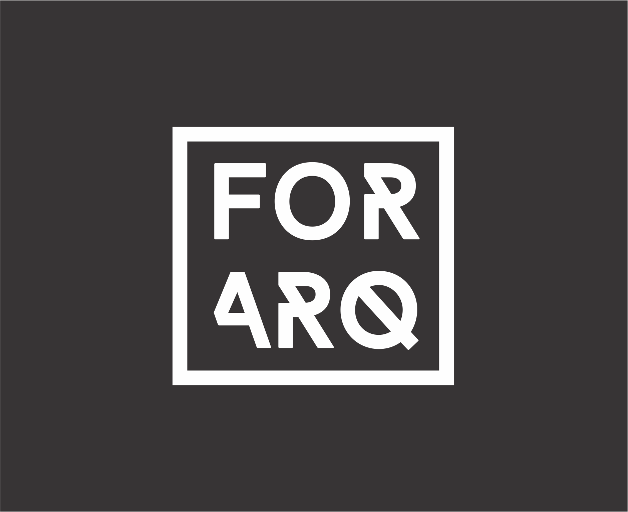
FORARQ
cristiano.togni | Wed, 05/11/2016 - 22:32
Brief from client
Logo for a company that makes sevices for architects
But that font is kinda bugging me though. It's not a bad font, but for the last few months, I'm seeing it everywhere, on every hipstery related mediums, flyers, electro album covers, etc. I find it goes against that simplicity you were going for, with its tricked out characters.
I agree with Jon about the diagonal lines, but even more bothersome is that the F and O are the only un-altered letters- and they are right next to each other. The lowercase version is worse I'm afraid.
I wish I had some advice to give, but it seems like finding a better font (which is essentially starting over for you) is all I have to give. Maybe you could modify a font yourself and have an easier time getting a good balance on the letterforms??? Anyhoo, good luck!
7 Comments
Well, as no one else is commenting. I'd like to say I love it. Great work!
I totally get the minimalist feel and I like it.
But that font is kinda bugging me though. It's not a bad font, but for the last few months, I'm seeing it everywhere, on every hipstery related mediums, flyers, electro album covers, etc. I find it goes against that simplicity you were going for, with its tricked out characters.
And about lowcase the same font?
I like this better.
Makes the Q more special
I think what's bugging my eyes is that all the diagonal angles are identical except for the Q.
I agree with Jon about the diagonal lines, but even more bothersome is that the F and O are the only un-altered letters- and they are right next to each other. The lowercase version is worse I'm afraid.
I wish I had some advice to give, but it seems like finding a better font (which is essentially starting over for you) is all I have to give. Maybe you could modify a font yourself and have an easier time getting a good balance on the letterforms??? Anyhoo, good luck!
And about this?