Brands of the World is the largest free library of downloadable vector logos, and a logo critique community. Search and download vector logos in AI, EPS, PDF, SVG, and CDR formats. If you have a logo that is not yet present in the library, we urge you to upload it. Thank you for your participation.
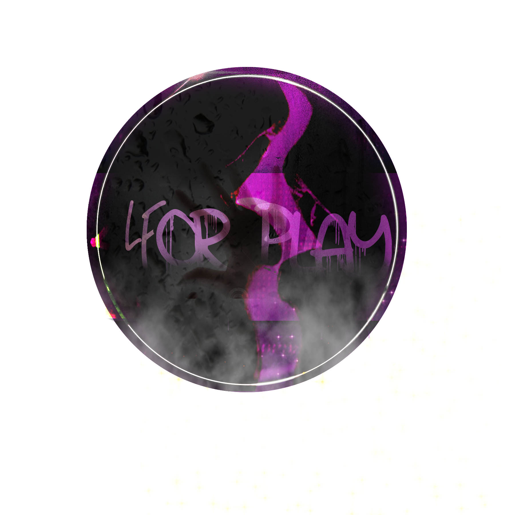
Too much texture. Keep it simple for now, You need something that will be a lot easier to put on any product.
I could barely read the text, and it took me forever to see that "For" also had an F as a 4. Maybe there's a way to do that (which I honestly doubt would be easy to read) but it's not executed the best at the moment. I think that text could be brought down into the open to let the symbol really shine.
The thing I really like about this logo is the direction it's going with the pink/purple between the lips. It looks like smoke or steam. I think if the circle was dropped, with only the pink/purple showing, it would be a more interesting and subtle way of showing steam and the lips. "ForPlay" could go under this with the smoke/steam rising from it, with a less grungy typeface.
Unreadable (i read "Leor Ham"), too many Photoshop filters, PIXELS!! (not even once:) no idea what that shape in the back is, not enough contrast, certainly done directly on the computer, no idea or concept...
One basic golden rule : never EVER use anything else than a vector based software to work on a logo. When it comes to logo design, pixel based softwares like Photoshop are out of the question, totally verboten! The main reason is that your logo will certainly need to be blown up in size or reduced. If it's made out of pixels, it'll be a nightmare because you will be contrived by resolutions and the bigger the size will get, the more pixelized it'll be. Whereas if it's made out of vector shapes, you don't have to worry about it, you could expand the logo time a billion and it'd still look good.
5 Comments
Too much texture. Keep it simple for now, You need something that will be a lot easier to put on any product.
I could barely read the text, and it took me forever to see that "For" also had an F as a 4. Maybe there's a way to do that (which I honestly doubt would be easy to read) but it's not executed the best at the moment. I think that text could be brought down into the open to let the symbol really shine.
The thing I really like about this logo is the direction it's going with the pink/purple between the lips. It looks like smoke or steam. I think if the circle was dropped, with only the pink/purple showing, it would be a more interesting and subtle way of showing steam and the lips. "ForPlay" could go under this with the smoke/steam rising from it, with a less grungy typeface.
I think this design will not have any element for a logo.
Unreadable (i read "Leor Ham"), too many Photoshop filters, PIXELS!! (not even once:) no idea what that shape in the back is, not enough contrast, certainly done directly on the computer, no idea or concept...
These are the main reasons your logo doesn't work. You need to revise your creative process. This link should help http://www.dwuser.com/education/content/zero-to-logo-the-creative-proces...
One basic golden rule : never EVER use anything else than a vector based software to work on a logo. When it comes to logo design, pixel based softwares like Photoshop are out of the question, totally verboten! The main reason is that your logo will certainly need to be blown up in size or reduced. If it's made out of pixels, it'll be a nightmare because you will be contrived by resolutions and the bigger the size will get, the more pixelized it'll be. Whereas if it's made out of vector shapes, you don't have to worry about it, you could expand the logo time a billion and it'd still look good.
So, pixels: FUCK NO, vector: YES PLEASE.
Good luck!
i have to agree with all the comments above, thanks for that link it is really helpful!
merci pour le liens :D
This is not working at all.
Shawali left that link is very useful for creating a logo.
So develop better ideas and can get something big here.