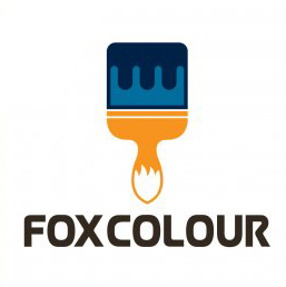
Fox Colour
S H A D | Mon, 02/29/2016 - 19:11
Brief from client
You are almost there
Hi friend i think i am almost there , here is the few version please advise
You are almost there
Hi friend i think i am almost there , here is the few version please advise
29 Comments
of these, Number 2. I am not a fan of the think outlines on the brush. It takes attention away from the important part- the fox tail!
Many Thanks
I'm really not feeling the blue bristles and the drips. They're just taking the focus away from the handle/tail. Keep it simple.
If you were wondering why your post has been changed, it's because you are only allowed one logo per post. You can always post additional logos in the comment section.
Thanks. i upload the new version please share your view on that
Very cool. I'm not sure that the colors on top of the brush are right.
Thanks friend
Here is something different. your comments will be appreciated
Perhaps this is a little better. Yesterday I forgot to tell you that the superior part of the brush was too similar to a piano.
Maybe this is better but I'm not really sure that this kind of blue is the better choice. I like it on the text but on the furr of the brush... mmm... I don't know.
Many Thanks. i agree with you on your comments but see the new version i think this will now better, please comment.
I don't know what is this all about. I just can say: Firefox is in the middle: in colors and obviously in the tail.
If this brand is related with technology business or something about aerospace the R is ok (but maybe, a little bit outdated, isn't it?)... so, if it is about anything else, then just change it.
I disagree- I do not think this is in any way similar to "firefox" and I am quite fond of your font choice. I think it works well with the logo. As for the colors, the blue is a complimentary color so it works too. I definitely prefer this version, the thick outlines were not doing your logo any favors. This way seems much cleaner to me.
My only thought may be the way the paint "drips" on your brush.Maybe it is too "perfect"??? I am not saying it would be better, but maybe you should play around with making the drips a bit more uneven? (not drastically random, just not so perfect) Just to see how that looks. Otherwise, I think this logo is coming together really nicely. =)
Many thanks.
i like your suggestion i update the version please comment back
Looky there! I think the uneven drips work! That's just my opinion, get some feedback on this version- but it's got my vote! Good job! =) =) =)
Thanks
The mark is spot on. The typography could benefit from a little more exploration.
As I said in my comment below, try creating more contrast by using a lighter font.
Fantastic with the uneven drips. I really think you've got a winner there.
Thanks
I much prefer the uneven drips.
Thanks
Now you know how much revision work is needed for a logo to make it onto Stocklogo. :)
Remember, this much work will be needed each time.
Hopefully this one makes it now, it really came together.
Yes the revision work alot. Many Thanks Waffles
It'd be nice if you would've created separate posts for each iteration, because the votes here apply only to the first version. The other versions are merely complying with someone else's comments.
Anyhow, regarding THIS version, I think it was 90% there, good job.
It took me several seconds to notice the fox's tail no the handle, but in the other versions seem to be easier to see now.
The outline on the brush, the even paint drops,weren't working for me. But you fix those.
The one thing that I feel is taking away from the mark is the type. Think about this: create contrast between the mark and the type. The mark is bold, thick and dense. Experiment with a lighter more simple typeface to achieve that contrast.
Good job +1.
-- I prefer not to vote than to downvote. The Typography isn't working for me.
Many Thanks for the comments. Yes i try the thicker fonts in the previous version but it not working
Hi S H A D
I was playing around with this idea, hope this can bring some new inspiration for your already finished/almost finished material.
I didn't know what the brief were about, so, i took it to do some playful yet industry standard approach, at least, that was what I was pretending :)
Good luck with the project!
Thanks this is look great
FYI: The top part of the brush is the same than the fox tail in the bottom, you just need to narrow it a bit so the details don't look too messy.
Again, good luck!
This reminds me of Mozilla Firefox. Do you want that? Firefox isn't quite anonimus..
How?
Because it it involves foxes? It looks nothing like firefox. The only thing remotely firefox about this is the colour, which is the colour of foxes!
Many many thanks Waffles for your answer