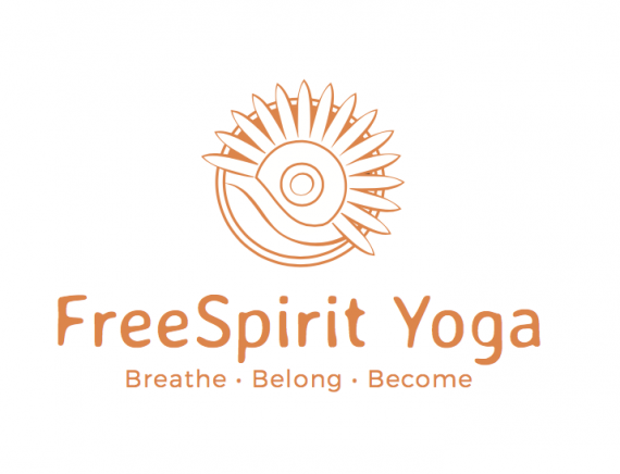
Freespirt Yoga
Jenny Dixon | Thu, 05/25/2017 - 07:22
Brief from client
This is a logo for a yoga studio that focuses on community, relaxation, spiritual fulfillment and personal growth. The shape is based on a flower mandala (a reference to sacred geometry commonly seen in yoga culture) combined with a sun setting over the ocean. The ocean sunset symbolizes relaxation, radiance, and the beachside community that the yoga studio resides in. (This was a school project for a real yoga studio I have been to before.)


5 Comments
Awe, I think this has some serious potential.
However I'm noticing it needs a lot of fine tuning.
First off, I love your concept. It feels very peaceful, very loose, and pretty.
I enjoy your font treatment, especially the fact that the main font is so loose while the sub font is rigid in contrast. I'm not sure if FreeSpirit is supposed to be one word or not, right now it feels like you just had a kerning issue. Maybe space the "S" and the "e" a little closer together.
As far as your symbol, I think that is what needs to most fine tuning. I would 100% like to see this in more than one color. I think a bold contrasting color, maybe even two (red and green, maybe even green and blue?) would really bring this to life. I don't think your strokes need to be so wispy. I can tell you used the Variable Width Profile in Illustrator, and I'm not so sure it works so well to give the desired effect you're looking for.
All in all, this logo makes me happy, but I'd love to see it pushed even further.
I find the symbol very soothing and pleasant to look at. I am not fond of the font I find it at odds with the free flowing lines of the symbol.
Thank you both for your feedback! I will keep making adjustments :)
Too much information on that flower, the pedals and tiny little background pieces left over behind also why the circles? Circle = closure, end, unless you want it to represent a run rise with that flower icon. Its way too much information, stick with one representation.
It reminded me of a sun, rather than just a flower. Especially with her color choice.