FreshWorld
penandlens | Thu, 07/25/2013 - 11:27
Brief from client
FreshWorld is an organic food producer and distributor trying to build a series of organic food store and organic food home delivery service. They require a logo that's clear, "fresh" and convey their commitment to organic product and global ambition

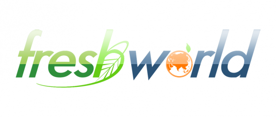
For this logo I decided to go with a bright, colorful tone, with a leaf and a globe as graphical representation of the brand's ideas. Green and blue are chosen as main color to evoke vegetables and water (fresh), and the globe is colored bright orange to suggest fruit. I originally used a script, "organic" typeface but opted for Futura instead for strength and legibility.


5 Comments
Personally I think there is too much goingon, logo's shoulf never be overly complicated. I don't think ther is a need to have the lighter colour on the top half of the text nor the two greens in the word fresh. And I would slightly increase the size of the globe in 'world'.
This is a good idea and on the grounds of what you have I think I would remember it.
Yes, it s too much going on. I would remove the gradient, the globe and keep the leaf. Also maybe try a script font. :)
I concur with above comment. Too many things happening ta the same time. Stick to no more than 1 symbol.
The shiny effect give it a "web" aspect that doesn't really fit the client.
Good luck!
shawali - no idea m8
i agree with the comment above. The italic font suggests speed (speedy delivery) this is a nice touch but the pointy W makes it to sharp and stingy. I would choose a smoother font type appealing to natural curves.