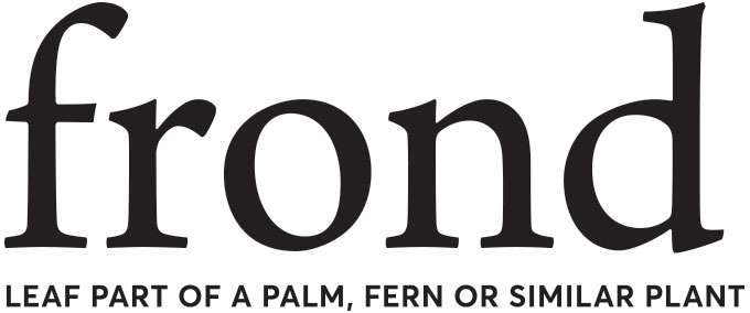
Frond
Brief from client
**Disclaimer: logo and tagline has been changed under strict NDA guidelines for this client. Match the font, spacing, etc to the original for critique.
A beauty brand for a masstige client. The customer is a thrifty 26-45 with focus on older millennials that differentiates by what is new & different and natural/organic.
The logo is primarily design as a logotype with no symbol or icons. Clean, modern with pairings of both serif and san-serif typefaces.
Frond is
● Approachable
● Cheerful
● Beautiful
● Quality
● Feminine
● Natural
● Eco friendly
● Trendy
● Fun
● Transparent
● Open minded
**Disclaimer: logo and tagline has been changed under strict NDA guidelines for this client. Match the font, spacing, etc to the original for critique.
Please be honest and provided reasons for why/how it works and doesn't work. Thank you!
Brand Purpose
With a mission to inspire people to make a commitment to healthy living, frond makes it easy to make a more thoughtful, better choice. Inspired by ancient beauty rituals, frond makes a cleaner lifestyle attainable for all.
Brand Positioning
For older millennials, frond is the best value for modern, high performance, naturally-inspired products in health and beauty. Formulated with natural ingredients sourced from around the world, frond makes it easy to make a more thoughtful, caring choice.
3 Comments
I'm gonna be honest: this is so underwhelming that it barely qualifies as a logo. If more than 10 minutes were spent on this, between turning on the computer to uploading it here, I'd be amazed. It's basically just two fonts on top of each other. That's pretty much it. And they are not even properly centered, let alone kerned.
I find not on single brand value listed above in this word mark. And most of the time, I find it to be the opposite of what the brand claims to be. It's not cheerful, approachable or fun, it's austere, unappealing and utterly boring.
I had a look at the Hatchbeauty website. There are some really cool projects in it and this botched attempt at a logo isn't up to par by a long shot.
It's back to square 1, with this time way more market research, inspiration and and a lot of sketching.
Keep it up!
I feel like we are just completely missing the entirety of this brand.
I understand that Hatch works on beauty products, and most beauty products need packaging for the brand to really come alive.
However we should be able to see SOME kind of refinement with the stand alone logo, and this is incredibly underwhelming. I would be curious to see how this is going to be sold on an actual bottle.
I'd like to come back a bit on my initial comment.
I think what doesn't serve this logo is that it's on its own. If it was presented within its environment, with a clear and well-crafted additional graphic elements, it may look more at its advantage.
I sense that it could look killer if it was the case. If it's so, I'm ready to fully revise my initial judgment.