FUMC Real Youth
Eli23 | Wed, 11/21/2018 - 00:03
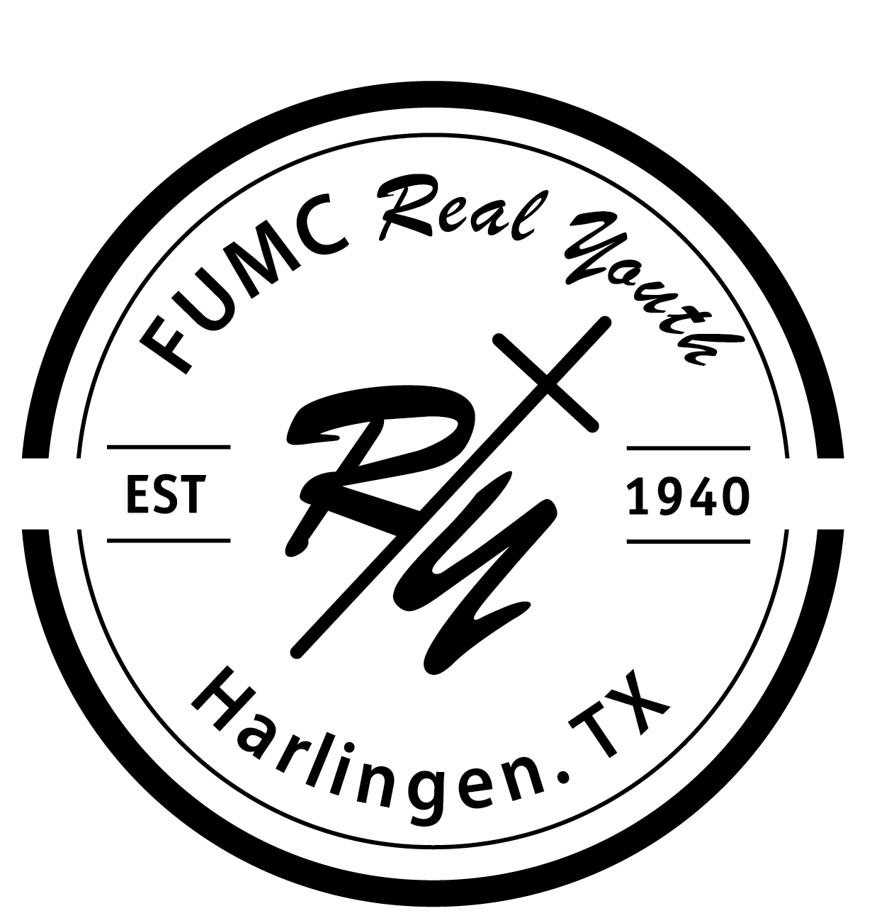
Brief from client
Client requested a simple logo for a youth christian camp. The client wanted a logo incorporated inside a circle and with the R and Y letters to interact with each other. The logo should demonstrate a simple yet youthful idea.
Hi, I would really appreciate any ideas, opinions and suggestions that you guys have for me, I am still in the learning process as a graphic designer I do believe that I still have a lot to learn and I'm willing to take any suggestions. Thank you :)
4 Comments
I don't see a lot of simple here. This is a very involved and complicated construction. My guess is they know they are from Harlingen, they don't need that in the logo. For youthfulness, lose the established in 1940 and find a font other than Brush Script. The circle isn't doing you any favors either, nor is the abbreviation of First United Methodist Church.
There is so much going on, I can't really tell what the name of the youth camp is. I think, for me, there is no focus.
Go back to the drawing board and write a list of all the things your logo should convey. Youth Camp Church...then start putting images with the words.
Is Real Youth their name or one you chose to use?
Ok, just to be clear, the logo is the RY thing with the cross, and only that. The whole thing is the badge version of your logo but shouldn't be the default version by any stretch.
For now, get rid of all the superfluous and focus on the core elements. Once you get that down, you can start thinking of other iterations, such as the badge.
Remember, a logo shouldn't be as much informative as it should leave a lasting impression in the beholder's eye. Simplicity is key here.
That scripted font you picked isn't really working. First off, it's an obvious cheap free type which does not include the ligatures, ie the link between every character that any decent script font should include. I can understand that you may not have the means to buy expensive fonts, but you can always find some really cool ones for free. Check out www.losttype.com or www.fontsquirrel.com
Also, it is not greatly designed. That Y is hard to make out and looks like a weird n or u.
The other font isn't great either. Way too plain and without any personality.
I fully agree with comments above
My main issue here is Brush Script
I find it completely useless , like hardly legible here; this 'Y' is horrible
I know it's informal, I know it's dynamic, but ... NO. ^_^
Agreed. Some good advice given above. That brush script style is one I'd avoid using on a curved path; almost illegible. I thin one of the most glaring downfalls is the lack of contrast in this design. I'd reconsider the hierarchy of the various elements presented here and edit the design accordingly. If you're trying to convey something youthful, I think that confining this to a (closed) circle shape counters that effort.