GameRookies
brechtvd | Mon, 03/07/2016 - 19:12
Brief from client
A project around the theme 'start to game' .

GameRookies
A project from 2 students in their first year of college.
The task is to make a website around the theme 'Start to game'.
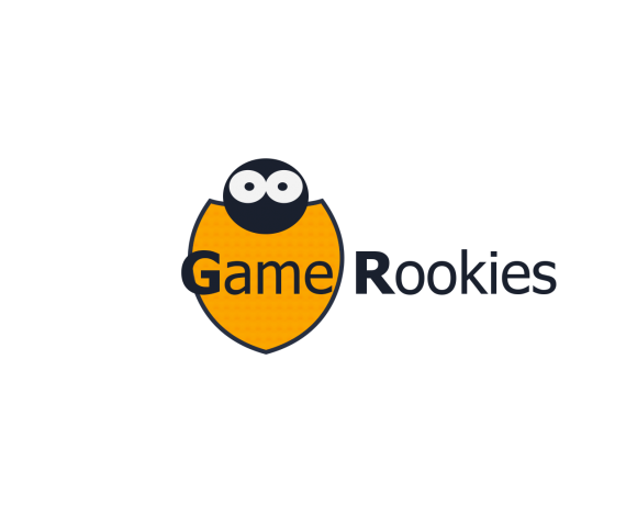
We went for an easy on the eye design with vibrant colors. Because the topic is 'start to game' we went for an appealing logo for the younger audiences. The symbol presents a curious guy who wants to look over the cover of his shield to gather information about what lays beyond the things he's already familliar and comfortable with.


3 Comments
I kinda get ladybug out of this. I don't see someone peering over a shield. I would also reconsider putting the text over the symbol...and I would change the font. I guess I am saying back to the drawing board.
I came in here to try to find a reason as to why Game Rookies were bugs. The symbol needs to show, you can't tell everyone what it is. :)
The first step is to disconnect the symbol from the text.
The idea is actually sound. A person peering over a shield could be a good logo, but it needs to be spot on perfect to work. I am afraid this has a long way to go.
The first letter bold is strange, and the font isn't fun or appealing to the younger crowd (or anyone). I think a complete overhaul is in order.
Good Luck! :) We are here for you.
I would add that you'd get more of a "peering" look if the face and eyes were partially concealed by the shield. Seeing the whole head is what is giving it more of a bug look.