Geared to Run
Brief from client
Client wants a logo for a running-related gear review website. Client wants the logo subtle, minimal, versatile, but effective (don't we all want that?).

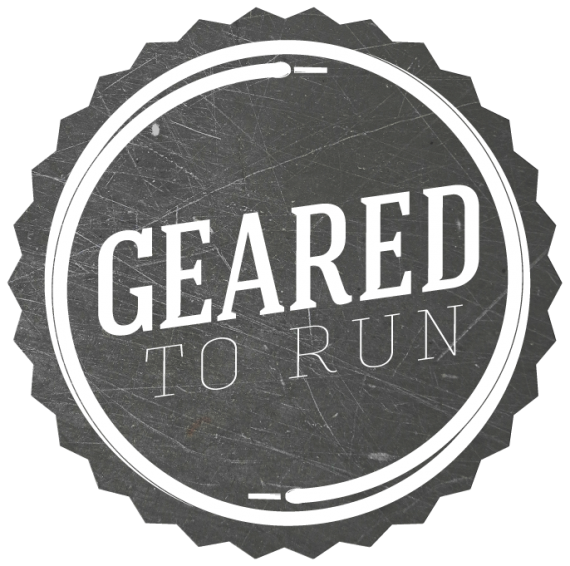
I wanted to deviate from a lot of the usual running-related logo designs out there and make sure I didn't go with the obvious shoe design. I thought laces would be nice instead. Running geeks will also spend time trying to figure out what shoe is used in the logo design and I wanted to keep it simple. My concern is that the laces won't be noticed. I could amp them up, but I think it will lose balance with the text.
Nice thing about the design is that the textured background is not necessary. It works well in black and white.
Text I wanted to strike a balance between the industrial and established feel of "Geared" and a more movement oriented type that contrasts well with the bold slab-serif above it.
The client also will refer to the site as "Geared" so I wanted to emphasize that over the "Geared to Run" in even balance.


6 Comments
First off, I really appreciate the thought and time put into this, and honestly it's a nice logo and definitely caught my attention. The shoe laces and type are rather nice, although the "To Run" type may be a bit too thin. The overall logo is really well balanced and looks nice as a whole, very trendy. One problem I think this design has is that I REALLY want to see that background image as a gear. I don't think it's SUPPOSED to be a gear, it's a vintage type symbol correct? with the "GEARED" being so prominent it really makes me want that image to be a gear, but it's not quite BUILT like a normal gear, so it's a bit strange. Overall quite nice though.
I totally agree. I'll upload the one of it as a gear and you can tell me what you thin, but when I looked at it as a gear I felt that it detracted from the shoelaces and kind of buried them. Also, the brand is about running apparel so I don't want to focus on gears since they are more tied to biking stuff, machinery, etc. "Geared" in this sense is more, "Running is what you are geared for, what you are meant to do, what you do, etc."
I'll up the gear version soon and definitely take a look.
I thought this was a bottle cap before I saw the large version.
I like it as an advertising piece but I don't think it would work as a logo. The 'to run' text is too thin and as I said before. When smaller it looks just like a bottle cap,
I like it but I have to agree with thecuraga
You should make the shoe laces go in a gear of some sort.