GemauDesign
GemauDesign | Mon, 01/06/2014 - 10:24
Brief from client
Ideas for my design business
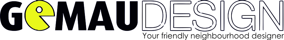
Fresh out of university I want to start up my own design business as a fall back. This is what I have so far, tried to keep it simple but have some flairs showing what my interests and background are. I am an avid gamer, hence the pac-man like symbol and the 'friendly neighbourhood' bit is a spider-man reference.
6 Comments
I like your ideas behind your design, but i feel its not being portrayed well enough.. check the kerning on gemau.. also the tag line "your friendly..." is already small and if you have to reduce the logo any further it might get lost/un readable. It also appears that design is blue-ish? im not sure but its not needed since its such a skinny font. I would clean it up, and give it another round!
Yeap all is good, but the slogan is very small, if you make the logo in 3 inches nobody can read that. And i think what Pacman have copyright. Check that if you dont go to jail.
hahaha
Good Luck and Sorry for my bad english
uhh not at all..
i don't like the packman, the color is... just ugly and not really friendly at all.
Maybe you should also delete the border around it.
Also the "spider man effect" will not do it. It looks you uploaded a low-res version of your logo.
BUTT i like the idea! only needs a bit more re-thinking
Don't like the idea or execution of it.
It doesn't represent what i'd want to see from a design company.
I'd go back to the drawing board with a pen/pencil and get a decent concept figured out before you went to a computer .
So the things you want to get across: 1. small scale, 2. friendly, 3. a background/interest in technology and gaming.
Avoid the silly pacman (too blunt, doesn't establish your own brand) and boring font (not recognizable) and catchphrase (we all know the phrase, and its a bit embarrassing to read it being associated with any business).
Instead, why not hand make a really nice old school looking pixelated font spelling out the name of the company, and using the "O" to make your own cute pixel-art character? That would immediately give you something that doesn't look corporate (1), is nostalgic and warm (2), gives you the chance to showoff your interest (3). You also get a brand ready mascot out of it.
Look at the poster for Wreck-It-Ralph, and tell me you don't want to make your own little pixelated mascot?
First of all I read GOMAU DESIGN.That's bad... And the stroke is like randomly cutted in some parts on purppose? or that's a JPG compression issue?
The colors are jwrong, yellow is a very specific color, harder to read for the eye .. I personally don't recommend it for a logo
Typo is so average, common and the biggest problem is that you are using a filled text with a stroked text!!! it doesn't match!!
the symbol don't fit with your profession, i know you like games but... don't mix things like a hobby and profession, that's useless It's like
I love ice cream and I'm a mechanic so at my logo I want an Ice cream driving a car (not)