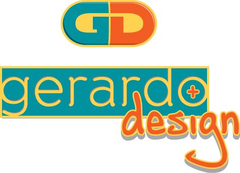
Gerardo Design pill of creativity
g3r4rd8 | Wed, 07/25/2012 - 19:47
Brief from client
This is actually my own logotype created a year ago in order to refresh the image of my freelance graphic design career. I'm a graphic designer/ illustrator, work as a art director/ art creator during the mornings at a screen printing shop and at evening I'm doing personal as well as client related graphic design. Got a BA on graphic design at UNIVA University campus Michoacan, Mexico on 2000, and I had been doing these professionally since then.


11 Comments
Icon for Gerardo Design.com whit more of a 3D felling on it.
Gray scale version of the logotype.
The "gd" work is nice, i like it. "Gerardo design" is weak , fonts are unprofessional and in contrast with the "pill" GD. Go in the same manner as massiveness, line and personality with the whole piece. About the colors, i am not sure about the yellow, try play with that. The rest is ok.
Appreciate your comment a lot, thank you for taking the time to do the input, and I am taking notes of your comments for my future reference.
Good day.
this is what we are here for, all of us. To share experience and constructive feedback. you're welcome.
Sorry Gerardo. I dont think it works... Your Icon maybe it works with a little more work on it. But the rest... in my opinion you should start all over again! With less details, avoid shadows and try more type options.
Try something clean... here an example.
I see where you going and I agree, maybe it's a little too much on the effects, but in the same direction I think that your option is a little too heavy. I appreciate your constructive criticism and I'm taking notes on this.
Thank you and good day.
You are allways welcome
I dig the "GD" pill looking thing, that works as far as I'm concerned, but I have to agree about the other part of it being a little too much. It doesn't really jive with the nice simplicity of the "GD".
But I think something like what geracao did above (with "GERARDO DESIGN" being really simple across the bottom) looks great! The only thing about the "GD" that I might change is to make the orange D a big brighter or more red!? It kind of blends in too much to the yellow-orange background.
Thanks a lot for the feedback, really helpful and delightful. I have been thinking on changing that orange for the PMS 17-1463 orange witch is darker and vivid but still orange. Thanks again.