Brands of the World is the largest free library of downloadable vector logos, and a logo critique community. Search and download vector logos in AI, EPS, PDF, SVG, and CDR formats. If you have a logo that is not yet present in the library, we urge you to upload it. Thank you for your participation.
Version history
Version 1

- I
- S
- T
- C


6 Comments
Nice job overall!
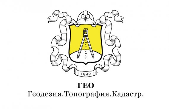
Now, two things that need some fixing: first, I think the ribbon is a bit of an overkill. They are really fun to do, but in this instance, it's just too much. The logo would work just fine without it, or at least just a small piece under the crest with the year on it.
Secondly, the subtext is way too prominent compared to the word mark, which is in turn way too small. I'm not a fan of the baseline being integral to the logo. IIt's ok to have one iteration with it, but the default version should be able to work without it.
Besides side that, this is really well made. Can you tell us what the text means?
EDIT : I know remember the first version for this company. This one is a huge improvement. Kudos to you.
Thank you for what you find time unselfishly helps young designers to make their products better. Your comment is very useful for me. I will facilitate the ribbon around the symbol . Signature under the logo : Geo . Surveying . Topography . cadastre
Dobroe vremya sutok, gospodin Shigapov! I remember your last post on this one - yes, giant step forward for upgrading vintage logo! Totally agree with Shawali on a ribbon issue. In addition want to suggest to make a compass above shield bigger and simplify a helmet around it , same goes for 1992. Now, because Russian is my native language, I had no problem getting a text. I would spread a subtext around a shield from center to center.GEO can go above compass. Like the fact that your color scheme resembles original Russian Empire flag - white/black/yellow. Another thing that I would like to mention is that shield line is much thicker than the rest of the logo - maybe by keeping all in a same thickness will look better.
:) Thank you for your helpful suggestions. Yes, the condition of the customer was to use in the logo colors of the flag of imperial Russia
i like very much your idea and i am looking forward to do something like this when i will have the opportunity. A very illustrative logo in a good way.Charlie and Felix pointed well enough the minus parts of this piece.
Thank you