Brands of the World is the largest free library of downloadable vector logos, and a logo critique community. Search and download vector logos in AI, EPS, PDF, SVG, and CDR formats. If you have a logo that is not yet present in the library, we urge you to upload it. Thank you for your participation.
Version history
Version 1

- I
- S
- T
- C


15 Comments
No... Try with a G with the same type of the rest.
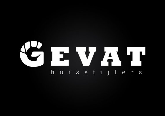
is the G supposed to be a fist?
Yes, "gevat" is a dutch synonymous for hold. It also means 1) Adrem 2) smart 4) Witty 5) dodgy 6) shrewdly 7) Easy 8) The collar grabbed 9) Pienter 10) Touch answers 11) Touch 12) shrewdly 13) Spirituality 14) Smieg 15) craftily 16) Smart 17 ) Decisive 18) Sharp 19) Schrander 20) witty 21) As regards 22) slept. I think you understand the translation....
I like the idea, but the "G" fist isn't coming across very clear. Also, not sure what the tag line is aligned to.
I saw the hand but... is not a hold hand in there, like a punch dont you think? agree with 2123, it is difficult to read your tag with this font.
I feel like I am seeing a different version of the logo than the rest of those who commented above - - I see the hand right away and it looks like it is holding a sphere or a ball or a circle (if it has to be holding anything at all; simply, it doesn't look like a fist to me).
Don't let my name fool you, I don't speak Dutch; so I cannot tell you if the meaning comes across quickly or not for those who do, but it did for me - especially after reading the comment explaining the meaning/translation.
As for the tagline, I do not find it either misaligned OR difficult to read. Again, not speaking the language I'm only basing my feedback on the letters being there - and being readable, which I feel they are.
I like it - and can only imagine that if I understood the language it I would like it even more.
you got to work on that "G" to look normal. My impression is that it doesn't look like a proper hand but it gives the idea of hand, so here is the problem. Also align the tag with the "t".
I agree the hand is your distinguishing feature in your logo, rather that trying to make a 'g' look like a hand/fist, why don't you try make a fist/hand look like a 'g'.
Just looking on the net I found this fist symbol from a band called fistmonkey, I quickly traced it to get my point across.
This is nice!
ik vind um wel vet xd.
probeer idd die G nog wat te verbeteren hij valt ook een beetje weg uit de rest van het lettertype =)
it kinda looks like a hand holding a ball but you really have to make an efford to find the hand, try to make it more like a hand i like the idea of ryanwiggill
improve the letter "G" just my thought =) best regards!
The hand looks a bit odd - The one from ryanwiggill is more obvious, but there again it is difficult to recognize the G. I would re-do the symbol completely.
the idea is good but you must used a fist and form a G within, fuse with EVAT
I tried not to read any of the other comments (it didn't work too well, but I tried!) so I'm just going to write what I was originally going to write before I read anything about the G or what it's supposed to be, etc.
I really like this logo- BUT I would definitely change the G to be the same font as the rest of it and then just keep those black lines going through it as you have it. I think the kerning of the subtext is fine! But I also like the version that Ryan did up above- his definitely looks more fist like (I never got 'fist' out of the original - I just like the way it looks) but it also looks less G like. Something in the middle of those, perhaps!?