Good construct job
allowski | Fri, 05/24/2013 - 20:19
Brief from client
The client requested a logo clean and beautiful. The company constructs homes..
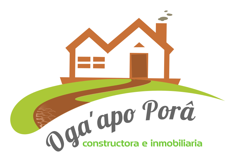
Hi guys, I'm here one more time. I need your opinion to correct this logo or do it again. I'm a begginer in logo design. Please give me your opinions.
5 Comments
I would suggest you get rid of the small details such as the clouds above the chimney and the texture at the end of the pathway.
Is there a reason for tilting the door?
This would be the HD logo with some extra details that after could be removed from it.
The tilting on the door should look like the door is half open..
What you say about the font?
Sorry my bad english, I speak only spanish.
I would suggest a font that is little more serious :)
Mmm bueno me llama la atención la textura del inicio de la calzada, me gustaría saber cual es su función, ya que me parece esta de más. En cuanto al tipo de letra, pues le da un toque fresco al logo manteniendo un lado serio.
This is nice, but with a whimsical symbol like that i think you don't need to go whimsical with the Typography too. If you want to keep the text on a curve, though, you should be extra careful with the kerning.