Brands of the World is the largest free library of downloadable vector logos, and a logo critique community. Search and download vector logos in AI, EPS, PDF, SVG, and CDR formats. If you have a logo that is not yet present in the library, we urge you to upload it. Thank you for your participation.
Version history
Version 1

- I
- S
- T
- C


8 Comments
The composition is good.
The rest is awful, unfortunately.
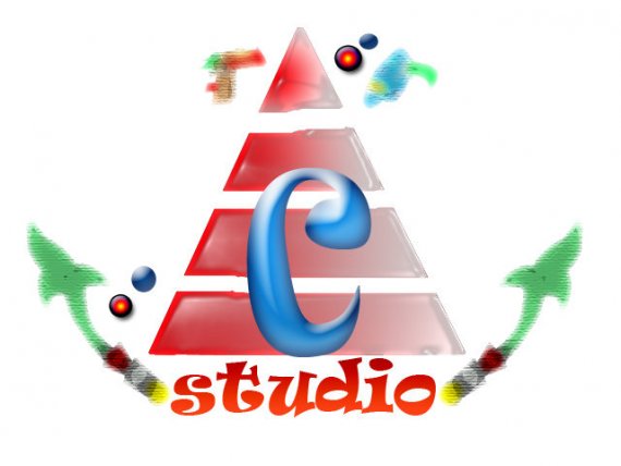
Basically, this is everything you shouldn't do when designing a logo. Unmatching colors, filters, effects, gradients, random shapes, terrible font choice... I don't mean to be harsh, but do not expect to attract much clients with this.
You got a lot to learn before opening a legitimate design studio.
Start with getting as much as inspiration as you can, with such sites as www.logopond.com www.fromupnorth.com www www.lookslikegooddesign.com This site will also help you understand how logos are made.
Find tutorials, get into a course or a design school or whatever.
Always sketch loads of ideas before jumping the shark with the computer. Softwares are only an executions tools. Creativity starts on paper.
Finally, upload more of your work on this site to get feedback. Even it's harsh, it can only help you.
God luck!
I have no words for this. I'm sorry, but is this a joke?
EVERYTHING is wrong with this - Everything.
I agree with Jon and especially shawali, I would hope this is not a joke and rather a first attempt at a logo.
Guys, to be fair, I really don't think this a joke. It's unbelievably bad but my first attempts at designing logos back in 1999 were that bad too. I used to think that this plastic filter on Photoshop made everything rad =)
To the OP, one last thing: never use Photoshop to design a logo. Use Illustrator.
I used to be quite taken with the plastic wrap and chrome filters in Photoshop. ;)
Shawali is an expert, please put attention to him write.
If you need a Logo for your studio, you need something serious, fancy and elegant, why the people take a bussines card of you, not see a joke.
Remove all the effects to Photoshop, and Make your own fonts, are just 2 words is not so hard.
Good Luck and Sorry for my bad english
I agree with all of the above.
First and foremost i'd use a pen and paper to get a decent concept, then when you do it on the computer (and eventually post it on here) post it in one colour - black and with no effects at all.
consider another profession